Discussion: Chapter 2: Exploring Datawith Tables and Graphs
Graphs are an important tool in mathematics, statistics, advertising, and the law. Not all graphs are created equal. In the following set of graphs, look at each one. On first glance, what does the graph give the impression of saying? Then study the graph carefully. Look for flaws or misleading elements. State any problems with the graph, if there are any.
Graph 2: 2012 GOP candidates
Graph 3: Gun deaths in Florida2
2.) Download the spreadsheet
Construct a Multiple Bar Graph of Income by Gender
In a multiple bars diagram two or more sets of inter-related data are represented (multiple bar diagram facilitates comparison between more than one phenomena).
You will be constructing a bar graph using data from the U. S. Census of the median incomes of males and females for different years from http://www.census.gov/hhes/www/income/data/historical/people/.
The data are provided in the BarGraph sheet.
Click and drag over the range A2:H4 to select these cells for the graph.
At the top of the screen, select Insert. Select the Column chart in the top row of the Charts group.
Select the leftmost chart in the 2-D Column row.
Click directly on the words Chart Title to change the title to Median Income by Gender.
To add other chart elements, click anywhere within the chart and then click on the plus sign. Select Axis Titles.
Click on the y-axis words Axis Title and type Median Income (thousands of dollars). Press [Enter].
Click on the x-axis words Axis Title and type Year. Press [Enter].
.
Construct a Pareto Chart of Educational Attainment
A Pareto chart is a bar graph. The lengths of the bars represent frequency or cost (time or money), and are arranged with longest bars on the left and the shortest to the right. In this way the chart visually depicts which situations are more significant.
Click on the Datatab and click on the Sort icon.
Make sure the box My data has headers is selected.
Under Columnsselect Sort by Percent.
Under Sort On select Cell Values.
Under Orderselect From Largest to Smallest.
Click OKto sort the data.
Click and drag over the range B2:C12 to select the state and percent data for the graph.
At the top of the screen, select Insert. Select the Column chart in the top row of the Charts group.Select the leftmost chart in the 2-D Column row.
To modify or add chart elements, click anywhere within the chart and then click on the plus sign. Select Axis Titles.
Click on the y-axis Axis Title and type Percent. Press [Enter].
Click on Percent(the chart title) and type Percent with Bachelor’s Degree or More by State. Press [Enter].
The chart is complete.
Construct a Pie Chart of Daily Activity
A pie chart, also known as a circle chart, is a circular diagram that resembles a pie. Each of the ‘slices’ represents a category of data that makes up the whole. Together, the pie represents 100 percent. The size of each ‘slice’ is relative to its portion of the whole.
This exercise presents a pie chart that displays data related to peoples daily activity. The data come from the Bureau of Labor Statistics, 2011 American Time Use Survey (http://www.bls.gov/tus/charts/). The pie chart you will construct will display time use on an average work.
The data are found on the PieChart sheet.
The data are not sorted and you must sort the data from highest to lowest percent. Select the cells A2:B14.
Click on the Data tab and click on the Sort icon.
A new window comes up.
Under Columnsselect Sort by Average per data, total.
Under Sort On select Cell Values.Under Orderselect From Largest to Smallest.
Click and drag over the range A2:B14 to select the activity and hours data for the pie chart.
At the top of the screen, select Insert. Select the Pie Chart in the bottom row of the Charts group.
Select the leftmost chart in the 2-D Pie row.
Because we want to add labels for the hours and activities, the chart needs to be larger. Click anywhere within the figure so that handles appear on the edges. Click and drag the handles to make the figure taller and wider.
To modify or add chart elements, click anywhere within the chart and then click on the plus sign. Select Chart Title and Data Labels. For data labels, select Data Callout.
Click directly on the chart title, Average per day, total, and type Time Use on an Average Work Day. Press [Enter].
At the bottom of the pie chart is a legend. You can delete the legend by clicking anywhere on the legend and hitting the Delete key.
The chart is complete
Upload the completed spreadsheet.
Essay Writing Service Features
Our Experience
No matter how complex your assignment is, we can find the right professional for your specific task. Achiever Papers is an essay writing company that hires only the smartest minds to help you with your projects. Our expertise allows us to provide students with high-quality academic writing, editing & proofreading services.
Free Features
Free revision policy
$10Free bibliography & reference
$8Free title page
$8Free formatting
$8How Our Dissertation Writing Service Works
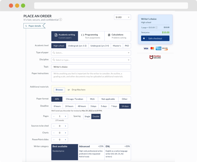
First, you will need to complete an order form. It's not difficult but, if anything is unclear, you may always chat with us so that we can guide you through it. On the order form, you will need to include some basic information concerning your order: subject, topic, number of pages, etc. We also encourage our clients to upload any relevant information or sources that will help.
Complete the order form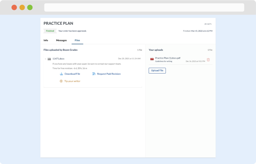
Once we have all the information and instructions that we need, we select the most suitable writer for your assignment. While everything seems to be clear, the writer, who has complete knowledge of the subject, may need clarification from you. It is at that point that you would receive a call or email from us.
Writer’s assignment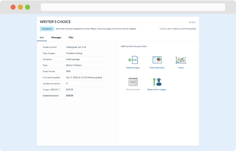
As soon as the writer has finished, it will be delivered both to the website and to your email address so that you will not miss it. If your deadline is close at hand, we will place a call to you to make sure that you receive the paper on time.
Completing the order and download