This is a research paper summary of four python assignments throughout the semester. Please strictly follow the (1)assignment requirements, and read carefully the (2) four python assignments, and the (3) comments given by the instructor. You must write using the findings from the four python assignments.
This assignment requires the completion of three parts of the research paper, Part 1: Digest, Part 6: Finding, and Part 7: Discussion. Each part should be at least 400 words.
Final Group Project | Urban Data Analysis
See the schedule in the syllabus for all assignment due dates and expectations. Group assignments need only one
submission per group, so nominate a single submitter to submit on behalf of the whole group. You will be graded on
your adherence to *all* the instructions. Please read the instructions carefully.
Overview
The final project (20% of the total course grade) is a cumulative and applied group assignment that requires you to
collectively use the skills you developed over the entire semester. You will pose a research question on a topic with an
urban context, then address it using the descriptive statistics, spatial analysis, inferential modeling, and data visualization
methods you have learned in this course. As you develop this project, this process may be iterative—your framing of your
research question will likely be informed by the kinds of data you have available, the kinds of data analysis methods at
your disposal, and the initial findings you produce. The final deliverable will be a combination of a research paper, a
Jupyter notebook (with all input data included in a zipped folder), and a single visual presentation slide.
Instructions
You will…
›
Develop an urban research question that interests your team.1
›
Collect data from two or more different sources, including but not limited to: the U.S. Census Bureau, local data
portals, county assessor websites, web map services, or any data resource listed on the Open Spatial Data Sources
Cheat Sheet available on Blackboard.
›
Clean, organize, merge, and process the data (using Python Pandas/Geopandas) into a neat, analyzable format.
›
Conduct a statistical analysis. This shall include, at a minimum, but not necessarily in this order: (1) an initial set of
descriptive statistics about your variables of interest; (2) some exploratory analysis; (3) data visualizations showing
any relevant distributions, comparisons, and/or correlations; and (4) a statistical model, such as a difference-ofmeans test, or a linear regression model. Unless instructed otherwise, use a sample size of n > 500 observations (e.g.,
rows or shapes, across any number of years) for any statistical test. Hint: You can recognize whether something is a
statistical test if you have a probability threshold (p) you are seeking to surpass under a given level of certainty.
›
Create four (4) or more Seaborn data visualizations, such as scatter plots, bar charts, line graphs, etc. Please use at
least two kinds of data visualization. For this assignment only, maps will not be considered a type of data visualization.
Format these Seaborn data visualizations using sns.set_context(‘paper’). Hint: Histograms and bar plots are technically
different types of data visualization, but you must be certain that you are using the correct type for the right purpose.
›
Create three (3) or more maps or cartograms, including at least one (1) choropleth map.
Most likely, you will be organizing and cleaning the data you downloaded in Group Assignment 1, visualized in Group
Assignment 2, mapped in Group Assignment 3, and analyzed through inferential statistics in Group Assignment 4 (and
optionally other new data, as needed).2
Components of the submission (portion of assignment grade in parentheses):
1 | Notebook (40%)
Create a new Jupyter notebook. Use Pandas and/or Geopandas to load your datasets and clean/process them as needed.
Include markdown text/comments throughout your notebook as necessary to annotate your code and data visualizations.
Ideally, your markdown will narrate your analysis and your in-code comments will provide brief step-by-step explanations
for the sake of replicability and quality control. Assume your reader is generally informed about the research topic but
unfamiliar with your data sources or your analytical process and may want to replicate it for themselves.
At the end of the notebook, include an “Authors” markdown cell that identifies each group member, describes their
contribution to this assignment (one sentence each), and provides contact information. Group members should contribute
to the project in whichever ways create proportional value: some will be better at code, others at writing, others at visual
communication, others at interpreting findings in the context of theory, etc.
2 | Research Paper (40%)
Write a narrative paper or report (illustrated with your data visualizations as in-line figures with titles) telling the story of
your analysis in 2,500+ words (not including tables, figures, captions, or references).3 Your submission should describe
your process and your findings, and must include the sections listed below. Importantly, you should *not* feel the need to
be exhaustive or definitive—save that for your capstone or thesis. The purpose of this paper is simply to get you started
working with quantitative data related to your work in planning, development, design, and/or policy, and to give you a
chance to practice and show off everything you’ve learned.
In your paper, incorporate the visualizations and analytical results into your narrative. Organize it into seven sections:
›
(1) Digest: In clear, non-technical prose, without extraneous information, present the most important findings of your
study for a general audience. Where necessary, explain your data sources and methodology and the results you
obtained, but be careful to avoid overly-technical language. Use statistics to shed light on the topic, not to dazzle or
distract the reader. Note the limitations of your study where necessary, but also help your reader understand what you
have learned as a result of this work, and why it matters. Tips: Write this section last, once you can coherently frame
your research question, findings, and conclusion. To help with the tone, you may want to format this section as a news
article, a policy memo, or a report to a community group or government committee.
›
(2) Background: Explain the context for your research question with a brief literature review not to exceed 500 words.
›
(3) Research Question: State your research question, and pose any hypothesis you may have (if applicable). You might
want to consider such topics as a “null hypothesis,” dependent and independent variables, confounding and lurking
variables, internal and external validity, and potential sources of bias and noise.
›
(4) Data Sources: Using the concepts of measurement, noise, bias, and/or validity, describe the datasets you used and
discuss any concerns or unanswered questions you have about them. Document any modifications or pre-processing
you made to the datasets. Explain how you treated missing values. Provide links to any online documentation about
the datasets you used. Be sure to address the broader question of whether (and how) these numbers relate to the
underlying concepts you are investigating (i.e., construct validity), and whether (and to what extent) you think that
these results can be generalized (i.e., external validity).
›
(5) Methods: Explain your data and your analytical process from a technical standpoint, in a way that would be familiar
to someone who *has* taken a data science course. Describe your methodology in a clear and succinct way, so that
someone interested in replicating your study in a different context would be able to do so.
›
(6) Findings: Lay out your findings, with data visualizations and/or tables, with particular attention to the signs /
magnitudes of any coefficients or z-scores. Your findings will be the immediate conclusions you draw from your
exploratory analysis and your statistical model, usually in the form of numerical results that would lead you to retain or
reject a null hypothesis.
›
(7) Discussion: Return to your research question and state what your analysis tells you about it more intellectually /
subjectively. Note the limitations of your study where necessary, but also help your readers understand what you have
learned as a result of this work. What is the big picture, and why are these findings important? Beyond what you have
already mentioned, what remaining concerns or questions do you have about your data, your methodology, and/or
your findings? How might you approach this problem differently in the future? What next steps would you recommend
for someone interested in exploring the quantitative aspects of this topic further? Be honest and cautious about what
we know, what we suspect, and what we still don’t understand, but also feel free to take a position where warranted
and recommend any actions that your (real or fictional) audience might want to consider as a result of what you have
learned.
Tell us a story about the real world using your results. Your analysis should convey a compelling data-driven story about
your research topic, informative at a high level to anyone not fully versed in data science methods, but also
comprehensible in the details to anyone trained in urban data analysis.
3 | Presentation Slide (20%)
Create a single digital presentation slide or poster (e.g., PowerPoint) showcasing one or more of your data visualizations or
maps, with any accompanying title(s), legend(s), text, and/or annotations that you deem appropriate. The slide/poster
must be at 16:9 aspect ratio, landscape orientation, and submitted as a PDF. This slide will be displayed on the in-class
projectors during our final project review on Dec. 8, and one or more member(s) of your group will give a compelling verbal
presentation summarizing your research project, referencing the visuals in the slide. The presentation will be kept to a
single slide per group so that (a) we can review all 14 submissions quickly and (b) everything in your presentation will be
visible at once, negating the need for slide transitions.
Tips: The requirements for the content on this slide are flexible. You get full credit simply for submitting a legible slide with at
least one data visualization or map on it. Incorporate whatever visual communications touches you deem appropriate. The
reward for design a visually impressive slide is simply clout among your peers. Format Seaborn data visualizations using
sns.set_context(‘talk’). Ensure your slide is legible to those who are colorblind. If you have Adobe Illustrator, you can check
this with View > Proof Setup. If you do not have Adobe Illustrator, simply avoid combinations of red and green.
Submission
Via Blackboard, submit a zip file containing the narrative (as a PDF), your visualization and map image file(s) (as PNGs or
JPGs), and the Jupyter notebook(s) and data files used to complete this project. Ensure that your Jupyter notebook runs
from the top to the bottom without any errors and that all the visuals can be seen inline (without us having to re-run your
notebook). Saving your notebook file with all outputs will help with this. Please note that the preparation and testing of
your submission items may take time, especially if you forgot to document your work as you went. We strongly
recommend that you do not leave these parts for the last day.
The final group project is due by 6:00PM PT on Dec. 8, 2022. There is no flexibility on this deadline, aside from a halfhour of leeway for troubleshooting any technical issues associated with the submission process. Submit a little early just
to be safe around the deadline.
Epilogue
›
Keep in mind that this assignment is more about methodology than about substantive research; we are not doing this
to evaluate your knowledge of your topic—that is for you, your advisor(s), your other professors, and your future
clients, employers, and research partners to worry about in other settings. To the extent possible, we will be limiting
our review to the aspects of the topic that relate to the work we have done in the class. So while you should certainly
draw on outside sources to frame your investigation as appropriate, please remember that the goal here is for you to
demonstrate technical mastery of statistical methods and quantitative reasoning, not to impress us with your outside
research.
Your research question cannot be a descriptive one, i.e., one that could be answered with simple descriptive statistics of existing variables.
Changing topics is no longer possible after Group Assignment 3.
3
The word count target for groups with only three members is 2,000+ words. Bear in mind, this description of the assignment alone is already 2,039
words long.
1
2
Group Assignment #1
Research Topic
Homeownership and Race/Ethnicity in Los Angeles County
Research topic context/importance:
There is a concern that homeownership has been a source of inequity in American society and
that this problem is more acute in Los Angeles County. This gap has roots in discriminatory
practices and legislation in favor of white homeownership throughout the decades as well as in
patterns of historic violence by white Angelenos against Black and Brown Angelenos’ vibrant
and prosperous communities (Mohajer, 2018).
Owning land and the home that you occupy is the most common way for Americans to create
generational wealth for their families (DeMatteo, 2022). The US has property inheritance laws
which allow property to be passed down through a will to children. Going back to the founding
of the country, the white settlers started occupying land and developing communities there while
also getting into conflicts with the indigenous societies. After wars and diseases, many
indigenous groups were forced to hand over their land to the US government. Afterwards,
indigenous societies were forcibly removed from their native land for future American
expansion. The US government, also, established strict private property laws and protections
which barred indigenous groups from reclaiming their land. Additionally, the Atlantic slave trade
led to an influx of Africans to the United States who were sold into slavery and unable to
purchase land. Only after the Civil War were Black slaves freed and able to start buying
property, which most could not afford for generations.
Before the Civil War, the government passed the Preemption Act and Homestead Act in which
the government sold up to 160 acres for low prices to citizens. Racial covenants became popular
in the 1920s as a way to prevent African Americans from buying homes (The Seattle Civil
Rights & Labor History Project University of Washington, 2020). The New Deal in the 1930s
introduced the new 30 year fixed rate mortgage loan, which helped predominantly white middle
class Americans buy homes in predominantly white areas. This practice persisted until it was
outlawed by the Fair Housing Act of 1968. In 1978 in California, voters passed Proposition 13,
which capped property tax increases on homes to no more than 2% a year. It has been argued
that since this practice benefits longtime homeowners over newer ones, that it indirectly places a
disproportionate tax burden on Black homeowners (Avenaneio-Leon & Howard, 2021).
Pressures on homeownership in California have continued with more legislation to further limit
property tax increases, such as with the passage of Prop 19, which allows older homeowners,
among others, to transfer their lower tax assessments when they move (Spagat, 2020).
1
Additionally, California and Los Angeles County have seen an explosion in house prices in the
last few decades before the COVID-19 Pandemic.
Research question:
Is there an association between race/ethnicity and homeownership in Los Angeles County?
We want to see if there are different outcomes for different races and ethnicities of Angelenos in
terms of homeownership.
We predict that white non-Hispanic Angelenos will have a high association with homeownership
while Hispanic any race Angelenos and Black non-Hispanic Angelenos will have a low
association with homeownership.
Datasets:
Data source 1: CalEnviroScreen 4.0- Housing Burden
● https://oehha.ca.gov/calenviroscreen/maps-data
● Publishing sites: Office of Environmental Health Hazard Assessment (OEHHA)
● Key variables: Housing burden, Unemployment, Poverty, Hispanic, White,
African American, Asian American and population density can be calculated from
the shape area and total population.
● Temporal range: data was published in October 2021 (The database time for each
indicator is varied, and the approximate time is 2010 to 2020.)
● Geographic scope: California
● Unit of analysis: Census tract
Data source 2: Los Angeles County Climate Vulnerability Assessment- Social Sensitivity
● https://lacounty.maps.arcgis.com/apps/webappviewer/index.html?id=c78e929d00
4846bb993958b49c8e8e65
● Publishing sites: lacounty.gov
● Key variables: Rent burden, Renters, Median income, Transit accessibility and
Household without vehicle access.
● Temporal range: 2012 -2019
● Geographic scope: Los Angeles County
● Unit of analysis: Census tract
Data source 3: California Climate Investments Priority Populations 2022 CES 4.0
2
●
●
●
●
●
●
https://webmaps.arb.ca.gov/PriorityPopulations/
Publishing sites: California Air Resources Board
Key variables: Low-income community, Disadvantaged community
Temporal range: data was published in May 2022
Geographic scope: California
Unit of analysis: Census tract
Data source 4:Comprehensive Housing Affordability Strategy (CHAS) 2015-2019
● https://www.huduser.gov/portal/datasets/cp.html#2006-2019_query
● Publishing sites: Housing and Urban Development (HUD)
● Key variables: Income distribution, Housing problem, Housing cost burden,
Income.
● Temporal range: data was published in September 2022
● Geographic scope: United State
● Unit of analysis: by city, county, state
Data source 5:Social Explorer- Housing&House Value
● https://www.socialexplorer.com/a9676d974c/explore
● Publishing sites: Social Explorer
● Key variables: House value, House occupancy, House type, Renting price
● Temporal range: 1960-2021
● Geographic scope: United State
● Unit of analysis: Census tract
Data source 6:CalEnviroScreen 4.0 and Race/Ethnicity Analysis
● https://calenviroscreen-oehha.hub.arcgis.com/apps/OEHHA::calenviroscreen-4-0and-race-ethnicity-analysis/explore
● Publishing sites: Office of Environmental Health Hazard Assessment (OEHHA)
Data source 7: US Census Bureau Table S2502
● https://data.census.gov/cedsci/table?t=Owner%2FRenter%20%28Tenure%29&g=
0500000US06037&y=2019&tid=ACSST1Y2019.S2502
● Publishing sites: data.census.gov
● Key variables:By race (renters, percentage renters, owner-occupied, owneroccupied percentage,ethnicity, educational attainment, year moved in, age.)
● Temporal range: 2019
● Geographic scope: Los Angeles County
● Unit of analysis: County
Data source 8: US Census Bureau Table B250003A-I – Housing tenure by race/ethnicity
3
● https://data.census.gov/cedsci/table?t=Owner%2FRenter%20%28Tenure%29%3
ARace%20and%20Ethnicity&g=0500000US06037&y=2019&tid=ACSDT1Y201
9.B25003A
● Publishing sites: data.census.gov
● Key variables: Renter-occupied, owner-occupied
● Temporal range: 2019
● Geographic scope: Los Angeles County
● Unit of analysis: Census tract
By analyzing the above datasets, we hope to not only explore the relationship between
homeownership and race/ethnicity, but to dig deeper into the data to attempt to identify the more
vulnerable neighborhoods in terms of other variables such as income, poverty index, rental
affordability and burden, and transit accessibility. We wish to illuminate how these areas
struggle with the housing crisis in order to inform policy and practice to help close the
racial/ethnic homeownership gap. We can do this by exploring the data in Python starting with
downloading the CSV files, dropping the unneeded columns, cleaning the data as necessary,
merging the datasets on a common geographic unit such as census tract, and spatially joining
them to shapefiles. We will visualize the data using various techniques and methods including
plotting and mapping and then try to generate a regression model(s) to identify and analyze any
correlation. We will interpret and communicate the results.
4
PPD534 HRED1 Group Assignment2.zip
GRADEMARK REPORT
FINAL GRADE
86
GENERAL COMMENTS
Instructor
Hi Group HRED 1,
/100
See my comments in the attached PDF printout of
the Jupyter notebook.
This is a great submission, but it has one minor
shortcoming in its markdown: I was looking for
more actual discussion in markdown of the
descriptive statistics of your variables’ distributions,
per the assignment description:
“Identify at least two quantitative variables of
interest and use relevant descriptive statistics to
discuss their distributions. If applicable, use
descriptive statistics on any sub-categories that
exist in your data, to explain variation within your
dataset as a whole.”
Presentation of these descriptive statistics through
.describe() or with box plots is unfortunately not
substantive enough. This resulted in a “Needs
Major Improvement” score for the Descriptive
Statistics component of the assignment grade
(-5%).
For your data visualizations, I am treating your first
bar plot as Data Viz 1, your top 50 tracts
scatterplots and regression plot as Data Viz 2, your
pie charts as Data Viz 3, your other scatterplots as
Data Viz 4, and your box plots as Data Viz 5. I am
spreading credit out in this way so that I am not
grading only one or two group members’ work.
Your renter/owner/pop and median
income/homeownership scatterplots have major
issues in formatting, execution, and interpretation,
as noted in the attached PDF printout. Some
common issues:
(1) Misinterpretation of renter/owner/pop
scatterplots as showing a positive linear correlation
when it was actually a mathematical relationship
between your x and y variables, which were too
similar in definition.
(2) Not spotting that ‘Latino Median Income’ and
‘Black Median Income’ were being treated as
categorical variables, causing graphing issues in
your scatterplots.
(3) Not removing potentially invalid measurements
behind the outliers along the x- and y-axis in the
Percent ___ Own / Rent scatterplots, likely leading
to skewed regression results.
These led to flawed interpretations of results in the
markdown sections that followed, although the
markdown notes in other parts of the assignment
were more in line with my expectations.
Since you provided a valuable abundance of data
visualizations, I’m condensing all these issues into
the Data Viz 4 category alone. This resulted in a
“Needs Major Improvement” score for that
component of the grade (-5%), and a “Needs Minor
Improvement” score for the Markdown component
of the grade (-4%).
Peer review & quality control of your submission as
a group are important, and they may have helped
identify these errors.
Please reach out if you have any questions.
~GK
PAGE 1
RUBRIC: GROUP ASSIGNMENT 2 RUBRIC
INSTRUCTIONS (20%)
0.86 / 1
1/1
Submission instructions, formatting instructions, quality control of script, timeliness
MEET/EXCEED
EXPECTATIONS
(1)
NEEDS MINOR
IMPROVEMENT
(0.80)
NEEDS MAJOR
IMPROVEMENT
(0.50)
NULL
(0)
DESC STATS (10%)
0.50 / 1
Descriptive statistics & any necessary data cleaning
MEET/EXCEED
EXPECTATIONS
(1)
NEEDS MINOR
IMPROVEMENT
(0.80)
NEEDS MAJOR
IMPROVEMENT
(0.50)
NULL
(0)
DATA VIZ 1 (10%)
1/1
MEET/EXCEED
EXPECTATIONS
(1)
NEEDS MINOR
IMPROVEMENT
(0.80)
NEEDS MAJOR
IMPROVEMENT
(0.50)
NULL
(0)
DATA VIZ 2 (10%)
1/1
MEET/EXCEED
EXPECTATIONS
(1)
NEEDS MINOR
IMPROVEMENT
(0.80)
NEEDS MAJOR
IMPROVEMENT
(0.50)
NULL
(0)
DATA VIZ 3 (10%)
1/1
MEET/EXCEED
EXPECTATIONS
(1)
NEEDS MINOR
IMPROVEMENT
(0.80)
NEEDS MAJOR
IMPROVEMENT
(0.50)
NULL
(0)
DATA VIZ 4 (10%)
0.50 / 1
MEET/EXCEED
EXPECTATIONS
(1)
NEEDS MINOR
IMPROVEMENT
(0.80)
NEEDS MAJOR
IMPROVEMENT
(0.50)
NULL
(0)
DATA VIZ 5 (10%)
MEET/EXCEED
EXPECTATIONS
(1)
1/1
NEEDS MINOR
IMPROVEMENT
(0.80)
NEEDS MAJOR
IMPROVEMENT
(0.50)
NULL
(0)
MARKDOWN (20%)
Introductory markdown, markdown for each data viz, general clarity of process.
MEET/EXCEED
EXPECTATIONS
(1)
NEEDS MINOR
IMPROVEMENT
(0.80)
NEEDS MAJOR
IMPROVEMENT
(0.50)
NULL
(0)
0.80 / 1
PPD534 NEW Group Project 2 Viz
1 of 30
about:srcdoc
Group HRED1 Data Exploration and Visualizations
In this notebook group members explore the ACS housing and income
tenure within and across the Latino, Black, Asian, and White racial/ethnic
categories and in relation to each other.
As our group visually explored facets of the data using a variety of different
variable pairs, we increased our shared understanding of the data and also
learned that sometimes visualizing smaller subsets of the data, as was the
case with homeownership and income, can help to reveal potential patterns.
This could lead us to explore and analyze the data more granularly and
across more dimensions in the future in order to understand what factors
might be apparently weakening the visible association as the size of the
dataset increases.
Being able to participate in hands-on labs during class and to work with the
practice notebooks was a big help in getting comfortable with the basics of
data anlysis and plotting in Python. Also, Tufte’s Visual Display of
Quantitative Information was a great introductory resource for learning how
to present data meaningfully using different visualization techniques and
methods.
As the project progresses during the rest of the semester, we hope to further
explore, both spatially and non-spatially, income as well as other dimensions
such as educational attainment or housing cost burden to further enhance
our study of the racial/ethnic homeownership gap in LA county.
In [302…
import pandas as pd
import numpy as np
import matplotlib.pyplot as plt
plt.style.use(‘default’)
import seaborn as sns
Anita’s plots
In [303…
#Read the housing tenure ACS data file
url = ‘ https://drive.google.com/file/d/15ipWRFudCm6RvpGjyAqR_daM6uVfqtRZ/view?usp=sharing’
path = ‘https://drive.google.com/uc?export=download&id=’+url.split(‘/’)[-2]
df_tenure = pd.read_csv(path)
In [304…
df_tenure.shape
Out[304]: (2498, 24)
In [305…
#list all the column names
col_list = df_tenure.columns.values.tolist()
print(col_list)
10/17/2022, 10:13 PM
PPD534 NEW Group Project 2 Viz
2 of 30
about:srcdoc
[‘Unnamed: 0’, ‘census_tract’, ‘Geography’, ‘Geographic Area Name’, ‘Total Latino P
op’, ‘Total Latino Own’, ‘Total Latino Rent’, ‘Total White Pop’, ‘Total White Own’,
‘Total White Rent’, ‘Total Asian Pop’, ‘Total Asian Own’, ‘Total Asian Rent’, ‘Tota
l Black Pop’, ‘Total Black Own’, ‘Total Black Rent’, ‘Percent White Own’, ‘Percent
White Rent’, ‘Percent Black Own’, ‘Percent Black Rent’, ‘Percent Latino Own’, ‘Perc
ent Latino Rent’, ‘Percent Asian Own’, ‘Percent Asian Rent’]
In [306…
#compute the weighted avarage of owners and reners across all LA country
#for each racial/ethnic group
weighted_avg_per_black_own = round(np.average(df_tenure[‘Percent Black Own’],
weights = df_tenure[‘Total Black Pop’]),2)
In [307…
print(weighted_avg_per_black_own)
0.33
In [308…
#compute the weighted avarage of owners and reners across all LA country
#for each racial/ethnic group
weighted_avg_per_white_own = round(np.average(df_tenure[‘Percent White Own’],
weights = df_tenure[‘Total White Pop’]),2)
In [309…
print(weighted_avg_per_white_own)
0.54
In [310…
#compute the weighted avarage of owners and reners across all LA country
#for each racial/ethnic group
weighted_avg_per_latino_own = round(np.average(df_tenure[‘Percent Latino Own’],
weights = df_tenure[‘Total Latino Pop’]),2)
In [311…
print(weighted_avg_per_latino_own)
0.39
In [312…
#compute the weighted avarage of owners and reners across all LA country
#for each racial/ethnic group
weighted_avg_per_asian_own = round(np.average(df_tenure[‘Percent Asian Own’],
weights = df_tenure[‘Total Asian Pop’]),2)
In [313…
print(weighted_avg_per_asian_own)
0.54
In [314…
df_weighted_avg = pd.DataFrame.from_records([{ ‘wa_black’: weighted_avg_per_black_own
‘wa_white’: weighted_avg_per_white_own,
‘wa_latino’: weighted_avg_per_latino_own,
‘wa_asian’: weighted_avg_per_asian_own }], index=’wa_black’)
In [315…
df_weighted_avg.head(2)
Out[315]:
wa_white
wa_latino
wa_asian
0.54
0.39
0.54
wa_black
0.33
10/17/2022, 10:13 PM
PPD534 NEW Group Project 2 Viz
3 of 30
about:srcdoc
In [316…
df_weighted_avg.reset_index(inplace=True)
In [317…
df_weighted_avg.head(2)
Out[317]:
0
wa_black
wa_white
wa_latino
wa_asian
0.33
0.54
0.39
0.54
In [318…
#rename columns
df_wa_rename = df_weighted_avg.rename(columns = {‘wa_black’:’Black’,
‘wa_white’:’White’,
‘wa_asian’: ‘Asian’,
‘wa_latino’: ‘Latino’})
In [319…
df_wa_rename.head(2)
Out[319]:
0
Black
White
0.33
0.54
Latino Asian
0.39
0.54
In [320…
#make ticks visible in jupyterlab dark theme
plt.style.use(‘default’)
In [321…
p = sns.catplot(
data = df_wa_rename,
kind = ‘bar’,
).set(title=’Percent Homeowners LA County’)
p.set( xlabel = “Race/Ethnicity”, ylabel = “Percent”)
plt.show()
10/17/2022, 10:13 PM
PPD534 NEW Group Project 2 Viz
4 of 30
about:srcdoc
The above category plot breaks down the total percentages of homeowners for all census
tracts within LA county by Black, White, Latino, and Asian racial/ethnic category. This plot
confirms our group’s research findings which show comparable homeownership rates
between Asian nd And White and keen disparities between those group and nonWhite/Asian groups, with Blacks trailing farthest behind.
In [322…
#Read the merged housing income ACS data file
url = ‘ https://drive.google.com/file/d/19CE_kjhjzIMC5jO37u7rEvkdOUGJlbmY/view?usp=sharing’
path = ‘https://drive.google.com/uc?export=download&id=’+url.split(‘/’)[-2]
df_merged = pd.read_csv(path)
In [323…
#list all the column names
col_list = df_merged.columns.values.tolist()
print(col_list)
[‘Unnamed: 0.1’, ‘Unnamed: 0’, ‘census_tract’, ‘Geography’, ‘Geographic Area Name’,
‘Total Latino Pop’, ‘Total Latino Own’, ‘Total Latino Rent’, ‘Total White Pop’, ‘To
tal White Own’, ‘Total White Rent’, ‘Total Asian Pop’, ‘Total Asian Own’, ‘Total As
ian Rent’, ‘Total Black Pop’, ‘Total Black Own’, ‘Total Black Rent’, ‘Percent White
Own’, ‘Percent White Rent’, ‘Percent Black Own’, ‘Percent Black Rent’, ‘Percent Lat
ino Own’, ‘Percent Latino Rent’, ‘Percent Asian Own’, ‘Percent Asian Rent’, ‘Latino
Median Income’, ‘White Median Income’, ‘Black Median Income’, ‘Asian Median Income
‘]
10/17/2022, 10:13 PM
PPD534 NEW Group Project 2 Viz
5 of 30
In [324…
about:srcdoc
df_merged.shape
Out[324]: (471, 29)
In [325…
df_selected_black= df_merged[[‘Percent Black Own’, ‘Black Median Income’]]
df_selected_black = df_selected_black.sort_values(by=[‘Percent Black Own’])
In [326…
df_selected_black.dtypes
Out[326]: Percent Black Own
Black Median Income
dtype: object
In [327…
float64
object
#count outliers that have median incomes ‘250,000+’
df_selected_black[‘Black Median Income’].value_counts()[‘250,000+’]
Out[327]: 12
In [328…
#remove those rows
df_selected_black = df_selected_black[df_selected_black[‘Black Median Income’] != ‘250,000+’
In [329…
df_selected_black.shape
Out[329]: (459, 2)
In [330…
#count outliers that have median incomes ‘250,000+’
df_selected_black[‘Black Median Income’].value_counts()[‘2,500-‘]
Out[330]: 3
In [331…
#remove those rows
df_selected_black = df_selected_black[df_selected_black[‘Black Median Income’] != ‘2,500-‘
In [332…
df_selected_black.shape
Out[332]: (456, 2)
In [333…
df_selected_black[‘Black Median Income’] = df_selected_black[‘Black Median Income’]
In [334…
df_selected_black.describe(include=’all’)
10/17/2022, 10:13 PM
PPD534 NEW Group Project 2 Viz
6 of 30
about:srcdoc
Percent Black Own
Black Median Income
count
456.000000
456.000000
mean
0.331205
80194.699561
std
0.326103
44980.715222
min
0.000000
10188.000000
25%
0.016346
48904.750000
50%
0.225952
68805.500000
75%
0.560457
101973.500000
max
1.000000
240437.000000
Out[334]:
In [335…
df_selected_black.tail(5)
Out[335]:
Percent Black Own
Black Median Income
49
1.0
137500
448
1.0
78287
449
1.0
130875
73
1.0
105714
217
1.0
110000
In [336…
#subset the data by the top 50 census tracts based on total black pop
df_selected_black_50large = df_merged.nlargest(50, ‘Total Black Pop’)
In [337…
df_selected_black_50large= df_selected_black_50large[[‘Total Black Pop’,’Percent Black Own’
df_selected_black_50large = df_selected_black_50large.sort_values(by=[‘Percent Black Own’
In [338…
df_selected_black_50large.head(5)
Out[338]:
Total Black Pop Percent Black Own
In [339…
Black Median Income
369
392
0.0
29196
441
600
0.0
39313
443
675
0.0
15034
53
579
0.0
52141
33
470
0.0
66085
df_selected_black_50large.dtypes
Out[339]: Total Black Pop
Percent Black Own
Black Median Income
dtype: object
int64
float64
object
10/17/2022, 10:13 PM
PPD534 NEW Group Project 2 Viz
7 of 30
about:srcdoc
In [340…
df_selected_black_50large[‘Black Median Income’] = df_selected_black_50large[‘Black Median In
In [341…
df_selected_black_50large.describe(include=’all’)
Total Black Pop Percent Black Own
Out[341]:
In [342…
Black Median Income
count
50.000000
50.000000
50.000000
mean
603.000000
0.327537
61496.240000
std
315.429413
0.279108
29375.819175
min
361.000000
0.000000
15034.000000
25%
392.250000
0.091496
42937.500000
50%
473.500000
0.283004
55815.000000
75%
670.500000
0.542670
75000.000000
max
1781.000000
0.980176
189450.000000
sns.relplot(
data = df_selected_black_50large,
x = ‘Black Median Income’,
y = ‘Percent Black Own’,
kind = ‘scatter’,
size = “Percent Black Own”,
hue = “Percent Black Own”
).set(title=’Top 50 LA County census tracts by Black pop’)
plt.show()
10/17/2022, 10:13 PM
PPD534 NEW Group Project 2 Viz
8 of 30
about:srcdoc
The above scatterplots indicate a positive association between income and Black
homwownership. This results confirms our group’s research which showed that income levels
are a strong rpedictor of homeownership for all groups.
In [343…
#repeat the same for other groups
df_selected_latino = df_merged[[‘Percent Latino Own’, ‘Latino Median Income’]]
In [344…
#count outliers that have median incomes ‘250,000+’
df_selected_latino[‘Latino Median Income’].value_counts()[‘250,000+’]
Out[344]: 3
In [345…
#remove those rows
df_selected_latino = df_selected_latino[df_selected_latino[‘Latino Median Income’]
In [346…
df_selected_latino.shape
Out[346]: (468, 2)
In [347…
df_selected_latino[‘Latino Median Income’] = df_selected_latino[‘Latino Median Income’
In [348…
df_selected_latino.describe(include=’all’)
10/17/2022, 10:13 PM
PPD534 NEW Group Project 2 Viz
9 of 30
about:srcdoc
Percent Latino Own
Latino Median Income
count
468.000000
468.000000
mean
0.394875
75573.423077
std
0.297186
35879.600075
min
0.000000
15690.000000
25%
0.129187
49922.000000
50%
0.354625
67133.000000
75%
0.655232
90258.750000
max
1.000000
246625.000000
Out[348]:
In [349…
#as in the descriptive stats for Black owners the same trend is apparent – as income rises
#homeownership is increasing
In [350…
#subset the data by the top 50 census tracts based on total latino pop
df_selected_latino_50large = df_merged.nlargest(50, ‘Total Latino Pop’)
In [351…
df_selected_latino_50large= df_selected_latino_50large[[‘Total Latino Pop’,’Percent Latino Ow
df_selected_latino_50large = df_selected_latino_50large.sort_values(by=[‘Percent Latino Own’
In [352…
df_selected_latino_50large[‘Latino Median Income’] = df_selected_latino_50large[‘Latino Media
In [353…
sns.relplot(
data = df_selected_latino_50large,
x = ‘Latino Median Income’,
y = ‘Percent Latino Own’,
kind = ‘scatter’,
size = “Percent Latino Own”,
hue = “Percent Latino Own”
).set(title=’Top 50 LA County census tracts by Latino pop’)
plt.show()
10/17/2022, 10:13 PM
PPD534 NEW Group Project 2 Viz
10 of 30
about:srcdoc
The above scatterplots indicate a positive association between income and Latino
homwownership. This results confirms our group’s research which showed that income levels
are a strong rpedictor of homeownership for all groups.
In [354…
#repeat the same for other groups
df_selected_white= df_merged[[‘Percent White Own’, ‘White Median Income’]]
In [355…
df_selected_white[‘White Median Income’] = df_selected_white[‘White Median Income’]
C:\Users\Anita\AppData\Local\Temp\ipykernel_21336\910207886.py:1: SettingWithCopyWa
rning:
A value is trying to be set on a copy of a slice from a DataFrame.
Try using .loc[row_indexer,col_indexer] = value instead
See the caveats in the documentation: https://pandas.pydata.org/pandas-docs/stable/
user_guide/indexing.html#returning-a-view-versus-a-copy
df_selected_white[‘White Median Income’] = df_selected_white[‘White Median Income
‘].astype(np.int64)
In [356…
df_selected_white.describe(include=’all’)
10/17/2022, 10:13 PM
PPD534 NEW Group Project 2 Viz
11 of 30
about:srcdoc
Percent White Own
White Median Income
count
471.000000
471.000000
mean
0.518735
83896.033970
std
0.317576
32108.980531
min
0.000000
8558.000000
25%
0.254923
62219.000000
50%
0.543333
80833.000000
75%
0.788961
102543.000000
max
1.000000
185500.000000
Out[356]:
In [357…
#subset the data by the top 50 census tracts based on total white pop
df_selected_white_50large = df_merged.nlargest(50, ‘Total White Pop’)
In [358…
df_selected_white_50large= df_selected_white_50large[[‘Total White Pop’,’Percent White Own’
df_selected_white_50large = df_selected_white_50large.sort_values(by=[‘Percent White Own’
In [359…
df_selected_white_50large[‘White Median Income’] = df_selected_white_50large[‘White Median In
In [360…
sns.relplot(
data = df_selected_white_50large,
x = ‘White Median Income’,
y = ‘Percent White Own’,
kind = ‘scatter’,
size = “Percent White Own”,
hue = “Percent White Own”
).set(title=’Top 50 LA County census tracts by White pop’)
plt.show()
10/17/2022, 10:13 PM
PPD534 NEW Group Project 2 Viz
12 of 30
about:srcdoc
The above scatterplots indicate a positive association between income and White
homwownership. This results confirms our group’s research which showed that income levels
are a strong rpedictor of homeownership for all groups.
In [361…
#repeat the same for other groups
df_selected_asian= df_merged[[‘Percent Asian Own’, ‘Asian Median Income’]]
In [362…
#count outliers that have median incomes ‘2,500-‘
df_selected_asian[‘Asian Median Income’].value_counts()[‘2,500-‘]
Out[362]: 2
In [363…
#remove those rows
df_selected_asian = df_selected_asian[df_selected_asian[‘Asian Median Income’] != ‘2,500-‘
df_selected_asian = df_selected_asian[df_selected_asian[‘Asian Median Income’] != ‘250,000+’
In [364…
df_selected_asian[‘Asian Median Income’] = df_selected_asian[‘Asian Median Income’]
In [365…
df_selected_asian.describe(include=’all’)
10/17/2022, 10:13 PM
PPD534 NEW Group Project 2 Viz
13 of 30
about:srcdoc
Percent Asian Own
Asian Median Income
count
461.000000
461.000000
mean
0.512294
90235.442516
std
0.314709
38492.305973
min
0.000000
11384.000000
25%
0.247126
62802.000000
50%
0.534381
86065.000000
75%
0.785395
115540.000000
max
1.000000
224167.000000
Out[365]:
In [366…
#subset the data by the top 50 census tracts based on total white pop
df_selected_asian_50large = df_merged.nlargest(50, ‘Total Asian Pop’)
In [367…
df_selected_asian_50large= df_selected_asian_50large[[‘Total Asian Pop’,’Percent Asian Own’
df_selected_asian_50large = df_selected_asian_50large.sort_values(by=[‘Percent Asian Own’
In [368…
df_selected_asian_50large[‘Asian Median Income’] = df_selected_asian_50large[‘Asian Median In
In [369…
sns.relplot(
data = df_selected_asian_50large,
x = ‘Asian Median Income’,
y = ‘Percent Asian Own’,
kind = ‘scatter’,
size = “Percent Asian Own”,
hue = “Percent Asian Own”
).set(title=’Top 50 LA County census tracts by Asian pop’)
plt.show()
10/17/2022, 10:13 PM
PPD534 NEW Group Project 2 Viz
14 of 30
about:srcdoc
The above scatterplots indicate a positive association between income and Asian
homwownership. This results confirms our group’s research which showed that income levels
are a strong rpedictor of homeownership for all groups.
In [370…
sns.regplot(
data = df_selected_asian_50large,
x = ‘Asian Median Income’,
y = ‘Percent Asian Own’
).set(title=’Top 50 LA County census tracts by Asian pop’)
plt.show()
10/17/2022, 10:13 PM
PPD534 NEW Group Project 2 Viz
15 of 30
about:srcdoc
The above regression plot shows the data and a linear regression model fit with the default
95% confidence interval displayed in the shaded area.
“Bad visualization”
Data analysts are often cautioned against the use of pie charts for data visualizations. This is
usually advised because many times pie charts are used with too many categories, which
makes it difficult for people to discern the differences between the categories. Below is an
example using the dataframe from above. As you can see, it is not very informative.
In [407…
plot = df_selected_asian_50large.plot.pie(y=’Percent Asian Own’, figsize=(5, 5))
10/17/2022, 10:13 PM
PPD534 NEW Group Project 2 Viz
16 of 30
about:srcdoc
10/17/2022, 10:13 PM
PPD534 NEW Group Project 2 Viz
17 of 30
about:srcdoc
If we reduce the number of census tracts being plotted to 5, then the pie chart visualization
becomes much more legible (we would still need to work on reformatting the y-axis ticks,
though).
In [408…
plot = df_selected_asian_5large.plot.pie(y=’Percent Asian Own’, figsize=(5, 5))
In [396…
#subset the data by the top 50 census tracts based on total white pop
df_selected_asian_5large = df_merged.nlargest(5, ‘Total Asian Pop’)
Smyrna’s plots
In [371…
#read the housing tenure file again (for Smyran’s plotting)
url = ‘ https://drive.google.com/file/d/15ipWRFudCm6RvpGjyAqR_daM6uVfqtRZ/view?usp=sharing’
path = ‘https://drive.google.com/uc?export=download&id=’+url.split(‘/’)[-2]
df = pd.read_csv(path)
In [372…
# Create a bar chart that shows the association between the total latino population and homeo
ax = sns.barplot(x=df[“Total Latino Pop”], y=df[“Total Latino Own”])
10/17/2022, 10:13 PM
PPD534 NEW Group Project 2 Viz
18 of 30
about:srcdoc
Pop = Owners line
The bar chart above shows the total latino population who are homeowners. We can see that
the association between the number of homeowners and the latino population is positive. As
the latino population increases, so do the amount of homeowners. This visualization will be
useful in our project by allowing us to understand how latinos differ in homeownership. By
analyzing each race and their total homeownership rates we can then analyze any ethnic
homeownership gaps. The reason why I chose to work with the scatterplot visualization was
because I felt inspired by the way that Professor Kantz went over examples of it during
lecture.
Latino Population
In [373…
# Create scatter plots for the same analysis. This time comparing latino owners and renters.
ax = sns.scatterplot(x=df[“Total Latino Pop”], y=df[“Total Latino Rent”]),
ax = sns.scatterplot(x=df[“Total Latino Pop”], y=df[“Total Latino Own”])
ax.set_ylabel(‘Total number of Renters/Owners’)
plt.legend(labels=[“Renters”,”Owners”])
Out[373]:
10/17/2022, 10:13 PM
PPD534 NEW Group Project 2 Viz
19 of 30
about:srcdoc
Pop = Renters line
Pop = Owners line
the actual best-fit lines
(tons of noise above
and below)
The scatterplot above shows the total latino population who are renters and homeowners.
The blue signifies the renters and the orange signifies homeowners. We can see that the
association between the number of renters and the latino population is linear and positively
correlated. We can say the same linear analysis for the number of owners and the total latino
population. As the Latino population increases, so do the amount of renters and
homeowners. We can see that the number of renters among the latino population are higher
than homeowners, and we can also see how there are a lot more homeowners clustered near
the x axis meaning low ownership numbers. Compared to other ethnic groups like whites,
blacks, and asians, the latino population seems to have higher population rates and overall,
higher ownership rates and renters. This visualization will be useful in our project by allowing
us to understand how latinos differ in homeownership and renter numbers. By analyzing
each race and their total homeownership rates we can then analyse any ethnic homeowner
gaps. The reason why I chose to work with the scatterplot visualization was because I felt
inspired by the way that Professor Kantz went over examples of it during lecture.
White Population
In [374…
# Create scatter plots for the same analysis. This time comparing white owners and renters.
ax = sns.scatterplot(x=df[“Total White Pop”], y=df[“Total White Rent”])
ax = sns.scatterplot(x=df[“Total White Pop”], y=df[“Total White Own”])
ax.set_ylabel(‘Total number of Renters/Owners’)
plt.legend(labels=[“Renters”,”Owners”])
Out[374]:
10/17/2022, 10:13 PM
PPD534 NEW Group Project 2 Viz
20 of 30
about:srcdoc
Pop = Renters line
Pop = Owners line
The scatterplot above shows the total white population who are renters and homeowners.
The blue signifies the renters and the orange signifies homeowners. We can see that the
association between the number of renters and the white population to be pretty linear in
the positive direction. We can say the same linear analysis for the number of owners and the
total white population. As the Latino population increases, so do the amount of renters and
homeowners. This visualization will be useful in our project by allowing us to understand
how whites differ in homeownership and renter numbers compared to other ethnicities and
see if there are significant disparities in the data. I felt inspired by the way that Professor
Kantz went over examples of it during lecture.
Black Population
In [375…
# Create scatter plots for the same analysis. This time comparing Black owners and renters.
ax = sns.scatterplot(x=df[“Total Black Pop”], y=df[“Total Black Rent”])
ax = sns.scatterplot(x=df[“Total Black Pop”], y=df[“Total Black Own”])
ax.set_ylabel(‘Total number of Renters/Owners’)
plt.legend(labels=[“Renters”,”Owners”])
Out[375]:
10/17/2022, 10:13 PM
PPD534 NEW Group Project 2 Viz
21 of 30
about:srcdoc
Pop = Renters line
Pop = Owners line
The scatterplot above shows the total black population who are renters and homeowners.
The blue signifies the renters and the orange signifies homeowners. We can see that the
association between the number of renters and the black population is slightly positively
correlated. We can say the same linear analysis for the number of owners and the total black
population. As the black population increases, so do the amount of renters and
homeowners. However, there are a lot less census tracts that have higher black populations.
Most of the black census tracts are clustered below the 1000 total black population which
shows that there are fewer black census tracts than other ethic groups like latinos. The
scatterplot also tells us that there seems to be more black renters than black homeowners
which was an interesting finding. This visualization will be useful in our project by allowing us
to understand how blacks differ in homeownership and renter numbers to other groups. By
analyzing each race and their total homeownership rates we can then analyse any ethnic
homeowner gaps. I felt inspired by the way that Professor Kantz went over examples of it
during lecture.
Asian Population
In [376…
# Create scatter plots for the same analysis. This time comparing asian owners and renters.
ax = sns.scatterplot(x=df[“Total Asian Pop”], y=df[“Total Asian Rent”])
ax = sns.scatterplot(x=df[“Total Asian Pop”], y=df[“Total Asian Own”])
ax.set_ylabel(‘Total number of Renters/Owners’)
plt.legend(labels=[“Renters”,”Owners”])
Out[376]:
10/17/2022, 10:13 PM
PPD534 NEW Group Project 2 Viz
22 of 30
about:srcdoc
Pop = Renters line
Pop = Owners line
The scatterplot above shows the total asian population who are renters and homeowners.
The blue signifies the renters and the orange signifies homeowners. We can see that the
association between the number of renters and the asian population is pretty linear. We can
say the same linear analysis for the number of owners and the total asian population. As the
asain population increases, so do the amount of renters and homeowners. We can see that
the number of renters among the asian population are about the same as the homeowners,
and we can see how there are a lot more homeowners clustered near the x axis meaning.
This visualization will be useful in our project by allowing us to understand how asians differ
in homeownership and renter numbers. By analyzing each race and their total
homeownership rates we can then analyse any ethnic homeowner gaps. I felt inspired by the
way that Professor Kantz went over examples of it during lecture.
Peter’s plots
In [377…
#Read the income ACS data file
url = ‘ https://drive.google.com/file/d/1ZgTR__qUCSLvL5IYAnMkNtxKCSb2CkOx/view?usp=sharing’
path = ‘https://drive.google.com/uc?export=download&id=’+url.split(‘/’)[-2]
df1 = pd.read_csv(path)
In [378…
#Read the housing tenure ACS data file
url = ‘ https://drive.google.com/file/d/15ipWRFudCm6RvpGjyAqR_daM6uVfqtRZ/view?usp=sharing’
path = ‘https://drive.google.com/uc?export=download&id=’+url.split(‘/’)[-2]
df2 = pd.read_csv(path)
10/17/2022, 10:13 PM
PPD534 NEW Group Project 2 Viz
23 of 30
In [379…
about:srcdoc
# Look at variable names
df1.columns
Out[379]: Index([‘Unnamed: 0’, ‘Geography’, ‘Geographic Area Name’,
‘Latino Median Income’, ‘census_tract’, ‘White Median Income’,
‘Asian Median Income’, ‘Black Median Income’],
dtype=’object’)
In [380…
df2.columns
Out[380]: Index([‘Unnamed: 0’, ‘census_tract’, ‘Geography’, ‘Geographic Area Name’,
‘Total Latino Pop’, ‘Total Latino Own’, ‘Total Latino Rent’,
‘Total White Pop’, ‘Total White Own’, ‘Total White Rent’,
‘Total Asian Pop’, ‘Total Asian Own’, ‘Total Asian Rent’,
‘Total Black Pop’, ‘Total Black Own’, ‘Total Black Rent’,
‘Percent White Own’, ‘Percent White Rent’, ‘Percent Black Own’,
‘Percent Black Rent’, ‘Percent Latino Own’, ‘Percent Latino Rent’,
‘Percent Asian Own’, ‘Percent Asian Rent’],
dtype=’object’)
In [381…
#Use geography as the index
df1 = df1.set_index(“Geography”)
df2 = df2.set_index(“Geography”)
In [382…
# use seaborn to scatter-plot two variables
ax = sns.scatterplot(x=df1[“Latino Median Income”], y=df1[“White Median Income”])
10/17/2022, 10:13 PM
PPD534 NEW Group Project 2 Viz
24 of 30
about:srcdoc
This was meant to be a test to see if there was a relationship between whites and latinos to
see if census tracts with high white median incomes also had high latino median incomes.
However, looking at this scatterplot, there does not seem to be an association.
In [ ]:
In [383…
# use seaborn to scatter-plot two variables
ax = sns.scatterplot(x=df1[“White Median Income”], y=df1[“Black Median Income”])
Same thing as before, but with Black instead of Latino. With this result as well, I believe it
might be safe to say that there is no association between any of the races/ethnicities and
median incomes.
In [384…
# use seaborn to scatter-plot two variables
ax = sns.scatterplot(x=df2[“Percent White Own”], y=df2[“Percent Latino Own”])
10/17/2022, 10:13 PM
PPD534 NEW Group Project 2 Viz
25 of 30
about:srcdoc
From above, I wanted to see if there was a correlation between ownership and race since the
median incomes did not represent a relationship. It looks like there is clear trend ignoring all
the framing from the outliers or extreme cases.
In [385…
#Adding a regression line to see if there is any correlation
ax = sns.regplot(x=df2[“Percent White Own”], y=df2[“Percent Latino Own”])
10/17/2022, 10:13 PM
PPD534 NEW Group Project 2 Viz
26 of 30
about:srcdoc
There we go. There is a small positive association. I wonder why that is.
In [386…
ax = sns.scatterplot(x=df2[“Percent Asian Rent”], y=df2[“Percent Black Rent”])
10/17/2022, 10:13 PM
PPD534 NEW Group Project 2 Viz
27 of 30
about:srcdoc
This one is a little less clear but there does seem to be an upward trend
In [387…
ax = sns.regplot(x=df2[“Percent Asian Rent”], y=df2[“Percent Black Rent”])
The line is also slightly positive. If incomes do not have an association then I’m thinking this
is about living in the area for a long time when owning a house was much cheaper and
attainable despite racist barriers.
In [388…
#Merge datasets to look for more relationships or associations
df3 = pd.merge(left = df1,right = df2, on = “census_tract”, validate = “one_to_one”
In [389…
df3.shape
Out[389]: (471, 29)
In [390…
# See if there is a relationship between incomes and percentage own by race/ethnicity
ax = sns.scatterplot(x=df3[“Percent Asian Own”], y=df3[“Asian Median Income”])
10/17/2022, 10:13 PM
PPD534 NEW Group Project 2 Viz
28 of 30
about:srcdoc
I hypthesized that having a higher median income would lead to more homeownership. This
result is surprising. It may be weakly positive, if not just zero.
In [391…
ax = sns.scatterplot(x=df3[“Percent Latino Own”], y=df3[“Latino Median Income”])
10/17/2022, 10:13 PM
PPD534 NEW Group Project 2 Viz
29 of 30
about:srcdoc
Same thing for latinos. There is a lack of association or a weak one at best.
In [392…
ax = sns.scatterplot(x=df3[“Percent Black Own”], y=df3[“Black Median Income”])
The lack of a relationship here makes me believe I can generalize this to all racial groups.
Since none so far have seen any association or relationship.
In [393…
ax = sns.scatterplot(x=df3[“Percent White Own”], y=df3[“White Median Income”])
10/17/2022, 10:13 PM
PPD534 NEW Group Project 2 Viz
30 of 30
about:srcdoc
It looks like most of our data is showing a small or no relationship between variables. Here, it
looks like only for white people that there is a clear relationship that is slightly positive.
In [394…
print(‘at end again4’)
at end again4
10/17/2022, 10:13 PM
Gloria GroupAssignment 02-2
1 of 11
about:srcdoc
Group Assignment02_GloriaG
In [1]: import pandas as pd
%matplotlib inline
import matplotlib.pyplot as plt
import numpy as np
import seaborn as sns
In [2]: df1 = pd.read_csv(‘calenviroscreen4 data.csv’)
df2 = pd.read_csv(‘LWAB_merged_income_ownRent_ACS_data.csv’)
Data Preparation
Merge ‘CalEnviroScreen4’ with ‘LWAB_merged’. Extract the score of
‘Educatio’,‘Unemployment’ and ‘Housing Burden’ from
‘CalEnviroScreen4’
In [3]: # Extracted the LA County data from CalEnviroScreen4
idx = df1.index[df1[‘California County’]==’Los Angeles’].tolist()
df_la = df1.loc[idx]
In [4]: # Redefine the ‘census_track’ in df2 to ‘GEO_10’
df2[‘census_tract’] = ‘6037’ + df2[‘census_tract’].astype(str)
df2[‘census_tract’] = df2[‘census_tract’].astype(float)
df2 = df2.rename(columns={“census_tract”: “Census Tract”})
In [5]: # Merge ‘CalEnviroScreen4’ and ‘LWAB_merged’
lst = list(range(5, 29))
lst.insert(0, 2)
df_all = pd.merge(df_la,
df2.iloc[:, lst],
on=’Census Tract’)
In [6]: df_all.shape
Out[6]: (405, 82)
In [8]: #list all the column names
col_list = df_all.columns.values.tolist()
print(col_list)
10/17/2022, 10:14 PM
Gloria GroupAssignment 02-2
2 of 11
about:srcdoc
[‘Census Tract’, ‘Total Population’, ‘California County’, ‘ZIP’, ‘Approximate Locat
ion’, ‘Longitude’, ‘Latitude’, ‘CES 4.0 Score’, ‘ CES 4.0 Percentile’, ‘CES 4.0 Per
centile Range’, ‘Ozone’, ‘Ozone Pctl’, ‘PM2.5’, ‘PM2.5 Pctl’, ‘Diesel PM’, ‘Diesel
PM Pctl’, ‘Drinking Water’, ‘Drinking Water Pctl’, ‘Lead’, ‘Lead Pctl’, ‘Pesticides
‘, ‘Pesticides Pctl’, ‘Tox. Release’, ‘Tox. Release Pctl’, ‘Traffic’, ‘Traffic Pctl
‘, ‘Cleanup Sites’, ‘Cleanup Sites Pctl’, ‘Groundwater Threats’, ‘Groundwater Threa
ts Pctl’, ‘Haz. Waste’, ‘Haz. Waste Pctl’, ‘Imp. Water Bodies’, ‘Imp. Water Bodies
Pctl’, ‘Solid Waste’, ‘Solid Waste Pctl’, ‘Pollution Burden’, ‘Pollution Burden Sco
re’, ‘Pollution Burden Pctl’, ‘Asthma’, ‘Asthma Pctl’, ‘Low Birth Weight’, ‘Low Bir
th Weight Pctl’, ‘Cardiovascular Disease’, ‘Cardiovascular Disease Pctl’, ‘Educatio
n’, ‘Education Pctl’, ‘Linguistic Isolation’, ‘Linguistic Isolation Pctl’, ‘Poverty
‘, ‘Poverty Pctl’, ‘Unemployment’, ‘Unemployment Pctl’, ‘Housing Burden’, ‘Housing
Burden Pctl’, ‘Pop. Char. ‘, ‘Pop. Char. Score’, ‘Pop. Char. Pctl’, ‘Total Latino P
op’, ‘Total Latino Own’, ‘Total Latino Rent’, ‘Total White Pop’, ‘Total White Own’,
‘Total White Rent’, ‘Total Asian Pop’, ‘Total Asian Own’, ‘Total Asian Rent’, ‘Tota
l Black Pop’, ‘Total Black Own’, ‘Total Black Rent’, ‘Percent White Own’, ‘Percent
White Rent’, ‘Percent Black Own’, ‘Percent Black Rent’, ‘Percent Latino Own’, ‘Perc
ent Latino Rent’, ‘Percent Asian Own’, ‘Percent Asian Rent’, ‘Latino Median Income
‘, ‘White Median Income’, ‘Black Median Income’, ‘Asian Median Income’]
In [9]: #keep needed columns
df_use=df_all[
[‘Census Tract’, ‘Total Population’, ‘Approximate Location’,’Pollution Burden’,
]
df_use.head(2)
Out[9]:
Census
Tract
Total Approximate
Population
Location
Pollution
Education
Burden
Education
Pctl
Poverty Unemployment
0 6037291210
5768
Los Angeles
78.23
25.6
74.34
44.3
10.3
1 6037219902
3809
Los Angeles
70.96
32.0
82.46
46.1
6.2
2 rows × 33 columns
In [10]: df_ue=df_use[“Unemployment”].describe()
print(df_ue)
count
401.000000
mean
5.882045
std
2.785566
min
0.400000
25%
3.800000
50%
5.500000
75%
7.300000
max
16.400000
Name: Unemployment, dtype: float64
Visualizing
‘Count how many times each cities appears in datafram’
10/17/2022, 10:14 PM
Gloria GroupAssignment 02-2
3 of 11
about:srcdoc
In [11]: # counts = df_use[“Approximate Location”].value_counts().sort_index()
# counts
In [25]: order = df_use[“Approximate Location”].value_counts().index
ax = sns.countplot(x=df_use[“Approximate Location”], order=order, alpha=0.7)
fig = ax.get_figure()
fig.set_size_inches(15,5)
fig
ax.set_xticklabels(ax.get_xticklabels(), rotation=45, horizontalalignment=”right”)
ax.set_xlabel(“Cityies in LA County”)
ax.set_ylabel(“Number of census tracts”)
Out[25]: Text(0, 0.5, ‘Number of census tracts’)
Housing Burden Index for each city
‘Before analyzing the connection between housing and race, it is necessary to
understand the rental pressures that each city faces. Understanding the big
picture will help in what comes next.’
In [26]: ax = sns.barplot(x=df_use[“Approximate Location”], y=df_use[“Housing Burden”])
fig = ax.get_figure()
fig.set_size_inches(15,5)
fig
ax.set_xticklabels(ax.get_xticklabels(), rotation=45, horizontalalignment=”right”)
ax.set_xlabel(“Cityies in LA County”)
ax.set_ylabel(“Housing Burden”)
Out[26]: Text(0, 0.5, ‘Housing Burden’)
10/17/2022, 10:14 PM
Gloria GroupAssignment 02-2
4 of 11
about:srcdoc
Compare Education,Employment Rate and Median Income in
the top 10 housing-vulnerable census tract cities and the top 10
least housing-vulnerable census tract cities.
The cities where the top 10 vulnerable Census Tract in Housing Burden are
located
In [27]: #’Hacienda Heights’,’El Segundo’,’El Segundo’,’Cerritos’,’Long Beach’,’Los Angeles’,’Duarte’,
df_hbtop10=df_use.nsmallest(n=10, columns=[‘Housing Burden’])
print (df_hbtop10)
10/17/2022, 10:14 PM
Gloria GroupAssignment 02-2
5 of 11
about:srcdoc
376
378
395
359
382
379
323
391
393
320
Census Tract
6037276000
6037408503
6037620001
6037400207
6037554515
6037574000
6037113232
6037430003
6037400205
6037570003
Total Population Approximate Location
5657
Los Angeles
6673
Hacienda Heights
4251
El Segundo
4608
La Verne
3793
Cerritos
5165
Long Beach
4315
Los Angeles
4971
Duarte
2846
Claremont
4119
Lakewood
376
378
395
359
382
379
323
391
393
320
Education
3.3
9.0
4.8
4.5
6.2
5.6
7.2
5.0
2.5
6.4
376
378
395
359
382
379
323
391
393
320
Total Latino Pop
470
622
300
288
131
243
273
458
99
390
376
378
395
359
382
379
323
391
393
320
Percent Latino Own
0.840426
0.942122
0.500000
0.906250
0.801527
0.781893
0.684982
0.945415
0.848485
0.658974
Percent Latino Rent
0.159574
0.057878
0.500000
0.093750
0.198473
0.218107
0.315018
0.054585
0.151515
0.341026
Percent Asian Own
0.670498
0.936646
0.583333
1.000000
0.840198
1.000000
1.000000
1.000000
1.000000
0.971591
376
378
395
359
382
379
323
391
393
320
Percent Asian Rent
0.329502
0.063354
0.416667
0.000000
0.159802
0.000000
0.000000
0.000000
0.000000
0.028409
Latino Median Income
144423
151439
139314
116034
87841
170795
120110
114397
246625
99706
White Median Income
140863
77656
121445
156719
89531
112298
119952
113750
165268
92768
Education Pctl
12.55
38.13
20.29
18.81
26.94
24.12
30.87
21.37
8.42
27.61
…
…
…
…
…
…
…
…
…
…
…
Poverty
6.3
11.7
11.4
8.3
8.7
7.7
14.3
9.5
3.5
10.4
Unemployment
2.0
4.6
5.7
5.7
1.4
2.5
1.5
8.7
3.0
4.5
Percent Black Own
0.000000
1.000000
0.454545
0.837209
0.618182
1.000000
0.785714
1.000000
1.000000
1.000000
Pollution Burden
53.73
30.91
56.22
37.31
39.44
48.73
51.66
31.86
41.98
47.40
Housing Burden
5.1
5.1
5.3
5.8
6.0
6.1
7.1
7.1
7.3
8.0
Percent Black Rent
1.000000
0.000000
0.545455
0.162791
0.381818
0.000000
0.214286
0.000000
0.000000
0.000000
\
\
\
\
\
10/17/2022, 10:14 PM
Gloria GroupAssignment 02-2
6 of 11
376
378
395
359
382
379
323
391
393
320
about:srcdoc
Black Median Income
95929
133250
76917
113798
153661
131129
199559
87500
250,000+
137656
Asian Median Income
163293
111397
153942
222132
87159
169500
250,000+
149438
250,000+
138750
[10 rows x 33 columns]
The cities where the top 10 ‘least’ vulnerable Census Tract in Housing Burden
are located
In [16]: #’Los Angeles’,’Long Beach’,’Glendale’,’Hawthorne’
df_hbleast10=df_use.nlargest(n=10, columns=[‘Housing Burden’])
print (df_hbleast10)
10/17/2022, 10:14 PM
Gloria GroupAssignment 02-2
7 of 11
about:srcdoc
160
150
68
6
5
92
20
26
39
55
Census Tract
6037234501
6037575102
6037575202
6037302401
6037117408
6037190510
6037191620
6037602002
6037209820
6037128601
Total Population Approximate Location
2845
Los Angeles
4151
Long Beach
4175
Long Beach
7395
Glendale
3073
Los Angeles
4051
Los Angeles
2532
Los Angeles
3057
Hawthorne
3073
Los Angeles
4369
Los Angeles
160
150
68
6
5
92
20
26
39
55
Education
25.5
41.7
55.1
21.0
40.8
15.1
42.0
28.5
56.4
15.8
160
150
68
6
5
92
20
26
39
55
Total Latino Pop
182
724
615
755
566
506
557
532
678
590
160
150
68
6
5
92
20
26
39
55
Percent Latino Own
0.928571
0.103591
0.175610
0.064901
0.074205
0.000000
0.147217
0.306391
0.140118
0.150847
Percent Latino Rent
0.071429
0.896409
0.824390
0.935099
0.925795
1.000000
0.852783
0.693609
0.859882
0.849153
Percent Asian Own
1.000000
0.137097
0.159363
0.171779
0.406780
0.000000
0.000000
0.368421
0.365854
0.434783
160
150
68
6
5
92
20
26
39
55
Percent Asian Rent
0.000000
0.862903
0.840637
0.828221
0.593220
1.000000
1.000000
0.631579
0.634146
0.565217
Latino Median Income
71250
41534
42279
59647
38088
56898
30272
58500
36823
65234
White Median Income
167679
26563
130521
46197
54750
34792
34271
65568
58542
47099
Education Pctl
74.17
91.19
98.37
66.46
90.50
55.53
91.43
78.23
98.63
57.24
…
…
…
…
…
…
…
…
…
…
…
Poverty
30.4
58.4
63.5
53.8
69.8
50.8
64.3
44.7
66.3
45.1
Unemployment
5.5
3.3
16.2
13.2
11.2
5.2
15.9
2.0
11.8
9.2
Percent Black Own
0.620232
0.000000
0.064935
0.000000
0.105263
0.000000
0.000000
0.275132
0.000000
0.168317
Pollution Burden
42.70
43.38
41.13
69.68
61.05
53.68
54.88
67.85
56.67
53.10
Housing Burden
47.6
43.6
41.7
41.0
40.8
40.1
39.5
39.5
39.5
39.3
Percent Black Rent
0.379768
1.000000
0.935065
1.000000
0.894737
1.000000
1.000000
0.724868
1.000000
0.831683
\
\
\
\
\
10/17/2022, 10:14 PM
Gloria GroupAssignment 02-2
8 of 11
160
150
68
6
5
92
20
26
39
55
about:srcdoc
Black Median Income
55809
30024
28977
94650
46111
50303
32782
60223
22143
66898
Asian Median Income
147500
31071
38897
91902
56964
46442
23750
183958
36971
126958
[10 rows x 33 columns]
Unemployment
These two sets of data show that the most vulnerable and non-vulnerable
communities are located in cities with Unemployment data
In [14]: citieshbtop10 = [‘Hacienda Heights’,’El Segundo’,’El Segundo’,’Cerritos’,’Long Beach’
df_citieshbtop10 = df_use[df_use[“Approximate Location”].isin(citieshbtop10)]
ax = sns.boxplot(x=df_citieshbtop10[“Unemployment”], y=df_citieshbtop10[“Approximate Location
In [15]: citieshbleast10 = [‘Los Angeles’,’Long Beach’,’Glendale’,’Hawthorne’]
df_citieshbleast10 = df_use[df_use[“Approximate Location”].isin(citieshbleast10)]
ax = sns.boxplot(x=df_citieshbleast10[“Unemployment”], y=df_citieshbleast10[“Approximate Loca
10/17/2022, 10:14 PM
Gloria GroupAssignment 02-2
9 of 11
about:srcdoc
Education
These two sets of data show that the most vulnerable and non-vulnerable
communities are located in cities with Education data
In [13]: citieshbtop10 = [‘Hacienda Heights’,’El Segundo’,’El Segundo’,’Cerritos’,’Long Beach’
df_citieshbtop10 = df_use[df_use[“Approximate Location”].isin(citieshbtop10)]
ax = sns.boxplot(x=df_citieshbtop10[“Education”], y=df_citieshbtop10[“Approximate Location”
In [17]: citieshbleast10 = [‘Los Angeles’,’Long Beach’,’Glendale’,’Hawthorne’]
df_citieshbleast10 = df_use[df_use[“Approximate Location”].isin(citieshbleast10)]
ax = sns.boxplot(x=df_citieshbleast10[“Education”], y=df_citieshbleast10[“Approximate Locatio
10/17/2022, 10:14 PM
Gloria GroupAssignment 02-2
10 of 11
about:srcdoc
Median Income
These two sets of data show the relationship between income and housing burden for whites
and people of color (Latinos in this case) in the top ten most vulnerables.
In [18]: citieshblast10 = [‘Hacienda Heights’,’El Segundo’,’El Segundo’,’Cerritos’,’Long Beach’
df_citieshblast10 = df_use[df_use[“Approximate Location”].isin(citieshblast10)]
ax = sns.scatterplot(x=df_citieshblast10[“Housing Burden”],
y=df_citieshblast10[“White Median Income”],
hue=df_citieshblast10[“Census Tract”],
alpha=0.8)
fig = ax.get_figure()
fig.set_size_inches(15,5)
fig
ax.set_xlabel(“Housing Burden”)
ax.set_ylabel(“White Median Income”)
Out[18]: Text(0, 0.5, ‘White Median Income’)
10/17/2022, 10:14 PM
Gloria GroupAssignment 02-2
11 of 11
about:srcdoc
In [22]: citieshblast10 = [‘Hacienda Heights’,’El Segundo’,’El Segundo’,’Cerritos’,’Long Beach’
df_citieshblast10 = df_use[df_use[“Approximate Location”].isin(citieshblast10)]
ax = sns.scatterplot(x=df_citieshblast10[“Housing Burden”],
y=df_citieshblast10[“Latino Median Income”],
hue=df_citieshblast10[“Census Tract”],
alpha=0.8)
fig = ax.get_figure()
fig.set_size_inches(15,5)
fig
ax.set_xlabel(“Housing Burden”)
ax.set_ylabel(“Latino Median Income”)
Out[22]: Text(0, 0.5, ‘Latino Median Income’)
In [ ]:
10/17/2022, 10:14 PM
AW_PPD534 Group Assignment2_Income
1 of 10
about:srcdoc
PPD534 Group HRED1 – Group Assigment #2 – Smyrna Caraveo,
Gloria Gao, Peter Monti, Anita Weaver
Income by Race/Ethnicity Data Source
and Content
This notebook reads, cleans/formats, merges and interprets
Census Bureau’s American Community Survey (ACS) data
downloaded from data.census.gov. Here is the link to the data
dictionary that further describes the table content
Table names:
• ### B19013B – MEDIAN HOUSEHOLD INCOME IN THE PAST 12 MONTHS
(BLACK OR AFRICAN AMERICAN ALONE HOUSEHOLDER)
• ### B19013D – MEDIAN HOUSEHOLD INCOME IN THE PAST 12 MONTHS
(ASIAN ALONE HOUSEHOLDER)
• ### B19013H – MEDIAN HOUSEHOLD INCOME IN THE PAST 12 MONTHS
(WHITE ALONE, NOT HISPANIC OR LATINO HOUSEHOLDER)
• ### B19013I – MEDIAN HOUSEHOLD INCOME IN THE PAST 12 MONTHS
(HISPANIC OR LATINO HOUSEHOLDER)
The tables are downloaded from the 2016-2020 ACS 5 Year
Estimate. The geographical area downloaded is LA county
census tract. The tables will be merged on census tract.
Note: For the purposes of this research
project exercise, no attempt was made to
analyze or exclude data based on margins of
error. More robust research would require
analysis of MOE and potentially the
exclusion of census tracts exhibiting higher
than acceptable measures.
Notebook created by Anita Weaver
10/23/2022, 12:35 PM
AW_PPD534 Group Assignment2_Income
2 of 10
about:srcdoc
Research Question
We will explore the ACS data through exploratory data analysis,
seeking eventually to confirm an expected association between
homeownership and race. We focus on Asian, Black, Latino, and
White, the predominant racial/ethnic groups in Los Angeles
County. We will attempt to explore income, in conjunction with
household tenure files, to try to understand any racial/ethnic
homeownership gaps.
In [1]: import pandas as pd
%matplotlib inline
import matplotlib.pyplot as plt
import numpy as np
In [2]: #link to publically shared Google Drive file
#Read the B19013B file
url = ‘ https://drive.google.com/file/d/1MLcc3P2qbUj4odDB4B0TifoXkzCV9wgI/view?usp=sharing’
path = ‘https://drive.google.com/uc?export=download&id=’+url.split(‘/’)[-2]
df_B19013B = pd.read_csv(path)
In [3]: df_B19013B.shape
Out[3]: (2498, 6)
In [4]: df_B19013B.tail(5)
10/23/2022, 12:35 PM
AW_PPD534 Group Assignment2_Income
3 of 10
about:srcdoc
Out[4]:
Annotation
Margin of
of Margin of
Error!!Median
Annotation of
Error!!Median
household
Estimate!!Median
household
income in the
income in the
past 12
income in the
past 12
months (in
past 12 months
months (in
2020
2020
inflationinflationadjusted
adjusted dollars)
adjusted
dollars)
dollars)
Geography
Geographic
Area Name
Estimate!!Median
household
income in the
past 12 months
(in 2020
inflationadjusted dollars)
2493 1400000US06037980038
Census
Tract
9800.38,
Los
Angeles
County,
Cali…
–
**
**
2494 1400000US06037980039
Census
Tract
9800.39,
Los
Angeles
County,
Cali…
–
**
**
2495
1400000US06037990100
Census
Tract
9901, Los
Angeles
County,
California
–
**
**
2496 1400000US06037990200
Census
Tract
9902, Los
Angeles
County,
California
–
**
**
2497 1400000US06037990300
Census
Tract
9903, Los
Angeles
County,
California
–
**
**
There are many rows with missing data. This link explains the likely reason as
being due to the fact that the ACS didn’t have enough data for those census
tracts to generate a median
In [5]: df_B19013B.shape
Out[5]: (2498, 6)
10/23/2022, 12:35 PM
AW_PPD534 Group Assignment2_Income
4 of 10
about:srcdoc
In [6]: #drop rows with no reported data
df_B19013B.drop(df_B19013B[df_B19013B[‘Estimate!!Median household income in the past 12 month
In [7]: df_B19013B.shape
Out[7]: (943, 6)
In [8]: df_B19013B.tail(3)
Out[8]:
Annotation
Margin of
of Margin of
Error!!Median
Annotation of
Error!!Median
household
Estimate!!Median
household
income in the
income in the
past 12
income in the
past 12
months (in
past 12 months
months (in
2020
2020
inflationinflationadjusted
adjusted dollars)
adjusted
dollars)
dollars)
Geography
Geographic
Area Name
Estimate!!Median
household
income in the
past 12 months
(in 2020
inflationadjusted dollars)
2452 1400000US06037920338
Census
Tract
9203.38,
Los
Angeles
County,
Cali…
175541
53921
NaN
2474
1400000US06037980016
Census
Tract
9800.16,
Los
Angeles
County,
Cali…
73750
5722
NaN
2483 1400000US06037980025
Census
Tract
9800.25,
Los
Angeles
County,
Cali…
56938
19528
NaN
In [9]: #list all the column names
col_list = df_B19013B.columns.values.tolist()
print(col_list)
[‘Geography’, ‘Geographic Area Name’, ‘Estimate!!Median household income in the pas
t 12 months (in 2020 inflation-adjusted dollars)’, ‘Margin of Error!!Median househo
ld income in the past 12 months (in 2020 inflation-adjusted dollars)’, ‘Annotation
of Margin of Error!!Median household income in the past 12 months (in 2020 inflatio
n-adjusted dollars)’, ‘Annotation of Estimate!!Median household income in the past
12 months (in 2020 inflation-adjusted dollars)’]
10/23/2022, 12:35 PM
AW_PPD534 Group Assignment2_Income
5 of 10
about:srcdoc
In [10]: #drop unneeded columns
df_B19013B_new = df_B19013B.drop([‘Margin of Error!!Median household income in the past 12 mo
‘Annotation of Margin of Error!!Median household income in
‘Annotation of Estimate!!Median household income in the past
],axis=1)
In [11]: df_B19013B_new.head(2)
Out[11]:
Geography
Geographic Area Name
Estimate!!Median household income in
the past 12 months (in 2020 inflationadjusted dollars)
8 1400000US06037102104
Census Tract 1021.04,
Los Angeles County,
Cali…
115729
18 1400000US06037104103
Census Tract 1041.03,
Los Angeles County,
Cali…
129000
In [12]: #check column names again
#list all the column names
col_list = df_B19013B_new.columns.values.tolist()
print(col_list)
[‘Geography’, ‘Geographic Area Name’, ‘Estimate!!Median household income in the pas
t 12 months (in 2020 inflation-adjusted dollars)’]
In [13]: #rename columns
df_B19013B_Black = df_B19013B_new.rename(columns={‘Estimate!!Median household income in the p
In [14]: df_B19013B_Black.head(3)
Out[14]:
Geography
Geographic Area Name
Black Median
Income
8 1400000US06037102104
Census Tract 1021.04, Los Angeles County,
Cali…
115729
18 1400000US06037104103
Census Tract 1041.03, Los Angeles County,
Cali…
129000
19 1400000US06037104105
Census Tract 1041.05, Los Angeles County,
Cali…
62143
In [15]: #create a new column for census tract number
df_B19013B_Black[‘census_tract’] = df_B19013B_Black[‘Geography’].str.slice(start=14
In [16]: df_B19013B_Black.tail(2)
10/23/2022, 12:35 PM
AW_PPD534 Group Assignment2_Income
6 of 10
about:srcdoc
Geography
Geographic Area Name
Black Median
Income
census_tract
1400000US06037980016
Census Tract 9800.16, Los
Angeles County, Cali…
73750
980016
2483 1400000US06037980025
Census Tract 9800.25, Los
Angeles County, Cali…
56938
980025
Out[16]:
2474
In [17]: #check dataframe for nulls
df_B19013B_Black.isna().sum().sum()
Out[17]: 0
In [18]: #link to publically shared Google Drive file
#Read the B19013D file
url = ‘ https://drive.google.com/file/d/1pvWsV-nMUawJc_DCejn_-pxggHl-DKKM/view?usp=sharing’
path = ‘https://drive.google.com/uc?export=download&id=’+url.split(‘/’)[-2]
df_B19013D = pd.read_csv(path)
In [19]: df_B19013D.shape
Out[19]: (2498, 6)
In [20]: #drop rows with no reported data
df_B19013D.drop(df_B19013D[df_B19013D[‘Estimate!!Median household income in the past 12 month
In [21]: df_B19013D.shape
Out[21]: (1557, 6)
In [22]: #drop unneeded columns
df_B19013D_new = df_B19013D.drop([‘Margin of Error!!Median household income in the past 12 mo
‘Annotation of Margin of Error!!Median household income in
‘Annotation of Estimate!!Median household income in the past
],axis=1)
In [23]: #rename columns
df_B19013D_Asian = df_B19013D_new.rename(columns={‘Estimate!!Median household income in the p
In [24]: #create a new column for census tract number
df_B19013D_Asian[‘census_tract’] = df_B19013D_Asian[‘Geography’].str.slice(start=14
In [25]: #check dataframe for nulls
df_B19013D_Asian.isna().sum().sum()
Out[25]: 0
In [26]: #link to publically shared Google Drive file
#Read the B19013H file
url = ‘ https://drive.google.com/file/d/1uSKdEs9G9xeKWvoeew1RIf0wNLsRaHMI/view?usp=sharing’
path = ‘https://drive.google.com/uc?export=download&id=’+url.split(‘/’)[-2]
df_B19013H = pd.read_csv(path)
10/23/2022, 12:35 PM
AW_PPD534 Group Assignment2_Income
7 of 10
about:srcdoc
In [27]: df_B19013H.shape
Out[27]: (2498, 6)
In [28]: #drop rows with no reported data
df_B19013H.drop(df_B19013H[df_B19013H[‘Estimate!!Median household income in the past 12 month
In [29]: #drop unneeded columns
df_B19013H_new = df_B19013H.drop([‘Margin of Error!!Median household income in the past 12 mo
‘Annotation of Margin of Error!!Median household income in
‘Annotation of Estimate!!Median household income in the past
],axis=1)
In [30]: #rename columns
df_B19013H_White = df_B19013H_new.rename(columns={‘Estimate!!Median household income in the p
In [31]: #create a new column for census tract number
df_B19013H_White[‘census_tract’] = df_B19013H_White[‘Geography’].str.slice(start=14
In [32]: #check dataframe for nulls
df_B19013H_White.isna().sum().sum()
Out[32]: 0
In [33]: #link to publically shared Google Drive file
#Read the B19013I file
url = ‘ https://drive.google.com/file/d/1K8rEjTIZWInWffXNWaugriYGGJp0ULzf/view?usp=sharing’
path = ‘https://drive.google.com/uc?export=download&id=’+url.split(‘/’)[-2]
df_B19013I = pd.read_csv(path)
In [34]: df_B19013I.shape
Out[34]: (2498, 6)
In [35]: #drop rows with no reported data
df_B19013I.drop(df_B19013I[df_B19013I[‘Estimate!!Median household income in the past 12 month
In [36]: #drop unneeded columns
df_B19013I_new = df_B19013I.drop([‘Margin of Error!!Median household income in the past 12 mo
‘Annotation of Margin of Error!!Median household income in
‘Annotation of Estimate!!Median household income in the past
],axis=1)
In [37]: #rename columns
df_B19013I_Latino = df_B19013I_new.rename(columns={‘Estimate!!Median household income in the
In [38]: #create a new column for census tract number
df_B19013I_Latino[‘census_tract’] = df_B19013I_Latino[‘Geography’].str.slice(start=
In [39]: #check dataframe for nulls
df_B19013I_Latino.isna().sum().sum()
10/23/2022, 12:35 PM
AW_PPD534 Group Assignment2_Income
8 of 10
about:srcdoc
Out[39]: 0
In [40]: df_B19013I_Latino.head(2)
Geography
Geographic Area Name
Latino Median
Income
census_tract
1400000US06037101110
Census Tract 1011.10, Los Angeles
County, Cali…
98000
101110
1 1400000US06037101122
Census Tract 1011.22, Los Angeles
County, Cali…
91840
101122
Out[40]:
0
In [41]: #merge datasets
df_merged_Latino_White = df_B19013I_Latino.merge(df_B19013H_White[[‘White Median Income’
left_on = ‘census_tract’, right_on = ‘census_tract’)
In [42]: df_merged_Latino_White.head(2)
Geography
Geographic Area Name
Latino
Median census_tract
Income
White
Median
Income
1400000US06037101110
Census Tract 1011.10,
Los Angeles County,
Cali…
98000
101110
60378
1 1400000US06037101122
Census Tract 1011.22,
Los Angeles County,
Cali…
91840
101122
86761
Out[42]:
0
In [43]: df_merged_Latino_White_Asian = df_merged_Latino_White.merge(df_B19013D_Asian[[‘Asian Median I
left_on = ‘census_tract’, right_on = ‘census_tract’)
In [44]: df_merged_Latino_White_Asian.head(2)
Geography
Geographic Area
Name
Latino
Median census_tract
Income
White
Median
Income
Asian
Median
Income
1400000US06037101110
Census Tract
1011.10, Los
Angeles County,
Cali…
98000
101110
60378
93333
1 1400000US06037101122
Census Tract
1011.22, Los
Angeles County,
Cali…
91840
101122
86761
166685
Out[44]:
0
In [45]: df_merged_Latino_White_Asian_Black = df_merged_Latino_White_Asian.merge(df_B19013B_Black
left_on = ‘census_tract’, right_on = ‘census_tract’)
In [46]: df_merged_Latino_White_Asian_Black.head(2)
10/23/2022, 12:35 PM
AW_PPD534 Group Assignment2_Income
9 of 10
about:srcdoc
Latino
Median census_tract
Income
White
Median
Income
Asian
Median
Income
Black
Median
Income
1400000US06037101110
Census Tract
1011.10, Los
Angeles
County,
Cali…
98000
101110
60378
93333
NaN
1 1400000US06037101122
Census Tract
1011.22, Los
Angeles
County,
Cali…
91840
101122
86761
166685
NaN
Latino
Median census_tract
Income
White
Median
Income
Asian
Median
Income
Black
Median
Income
Out[46]:
0
Geography
Geographic
Area Name
In [47]: #rename the dataframe
df_LWAB_income = df_merged_Latino_White_Asian_Black
In [48]: df_LWAB_income.head(2)
Out[48]:
Geography
Geographic
Area Name
1400000US06037101110
Census Tract
1011.10, Los
Angeles
County,
Cali…
98000
101110
60378
93333
NaN
1 1400000US06037101122
Census Tract
1011.22, Los
Angeles
County,
Cali…
91840
101122
86761
166685
NaN
0
In [49]: df_LWAB_income.shape
Out[49]: (2213, 7)
In [50]: #check dataframe for nulls
df_LWAB_income.isna().sum().sum()
Out[50]: 2693
In [51]: #count the rows with missing values
sum([True for idx,row in df_LWAB_income.iterrows() if any(row.isnull())])
Out[51]: 1742
10/23/2022, 12:35 PM
AW_PPD534 Group Assignment2_Income
10 of 10
about:srcdoc
In [52]: #we will drop the rows with missing values because it will still leave us with a dataset of >
# hopefully enough of s sample (close to 500) to hopefully do some meaningful data exploratio
#for our research question
df_LWAB_income = df_LWAB_income.dropna(how=’any’,axis=0)
In [53]: df_LWAB_income.shape
Out[53]: (471, 7)
In [54]: #write the dataframe to a .csv
df_LWAB_income.to_csv(“LWAB_income_ACS_data.csv”)
In [55]: print(‘at end5’)
at end5
10/23/2022, 12:35 PM
AW_PPD534 Group Assignment2_OwnRent
1 of 12
about:srcdoc
PPD534 Group HRED1 – Group Assigment #2 – Smyrna Caraveo,
Gloria Gao, Peter Monti, Anita Weaver
Housing Tenure by Race/Ethnicity Data
Source and Content
This notebook reads, cleans/formats, merges and interprets
Census Bureau American Community Survey (ACS) data
downloaded from data.census.gov. The table IDs and names are:
• ### B25003B – TENURE (BLACK OR AFRICAN AMERICAN ALONE
HOUSEHOLDER)
• ### B25003D – TENURE (ASIAN ALONE HOUSEHOLDER)
• ### B25003H – TENURE (WHITE ALONE, NOT HISPANIC OR LATINO
HOUSEHOLDER)
• ### B25003I – TENURE (HISPANIC OR LATINO HOUSEHOLDER)
The tables are downloaded from the 2016-2020 ACS 5 Year
Estimate. The geographical area downloaded is LA county
census tract. Each file contains the total population and
percentage of homeowners and renters by the race/ethnicity
categories listed above. The tables will be merged on census
tract.
Note: For the purposes of this research
project exercise, no attempt was made to
analyze or exclude data based on margins of
error. More robust research would require
analysis of MOE and potentially the
exclusion of census tracts exhibiting higher
than acceptable measures.
Notebook created by Anita Weaver
In [ ]:
10/23/2022, 12:36 PM
AW_PPD534 Group Assignment2_OwnRent
2 of 12
about:srcdoc
Research Question
We will explore the ACS data through exploratory data analysis,
seeking eventually to confirm an expected association between
homeownership and race. We focus on Asian, Black, Latino, and
White, the predominant racial/ethnic groups in Los Angeles
County. We will attempt to explain gaps in homeownership by
race by examining other variables (as time allows) including
income.
In [1]: import pandas as pd
%matplotlib inline
import matplotlib.pyplot as plt
import numpy as np
In [2]: #link to publically shared Google Drive file
#Read the B25003B file
url = ‘ https://drive.google.com/file/d/1ofXtygB64RjwVx0bFcHxfaP7cD8pXZWj/view?usp=sharing’
path = ‘https://drive.google.com/uc?export=download&id=’+url.split(‘/’)[-2]
df_B25003B = pd.read_csv(path)
In [3]: df_B25003B.shape
Out[3]: (2498, 14)
In [4]: df_B25003B.head(2)
Out[4]:
Geographic
Geography
Area Name
Annotation of
Margin of
Estimate!!Total:
Estimate!!Total: Error!!Total:
Annotation
of Margin
of
Error!!Total:
1400000US06037101110
Census
Tract
1011.10,
Los
Angeles
County,
Cali…
8
NaN
14
NaN
1 1400000US06037101122
Census
Tract
1011.22,
Los
Angeles
County,
Cali…
9
NaN
13
NaN
0
In [5]: #list all the column names
col_list = df_B25003B.columns.values.tolist()
print(col_list)
10/23/2022, 12:36 PM
AW_PPD534 Group Assignment2_OwnRent
3 of 12
about:srcdoc
[‘Geography’, ‘Geographic Area Name’, ‘Estimate!!Total:’, ‘Annotation of Estimate!!
Total:’, ‘Margin of Error!!Total:’, ‘Annotation of Margin of Error!!Total:’, ‘Estim
ate!!Total:!!Owner occupied’, ‘Margin of Error!!Total:!!Owner occupied’, ‘Annotatio
n of Margin of Error!!Total:!!Owner occupied’, ‘Annotation of Estimate!!Total:!!Own
er occupied’, ‘Estimate!!Total:!!Renter occupied’, ‘Margin of Error!!Total:!!Renter
occupied’, ‘Annotation of Margin of Error!!Total:!!Renter occupied’, ‘Annotation of
Estimate!!Total:!!Renter occupied’]
In [6]: #drop unneeded columns
df_B25003B_new = df_B25003B.drop([‘Annotation of Estimate!!Total:’, ‘Margin of Error!!Total:’
‘Annotation of Margin of Error!!Total:’ , \
‘Margin of Error!!Total:!!Owner occupied’, \
‘Annotation of Margin of Error!!Total:!!Owner occupied’
‘Annotation of Estimate!!Total:!!Owner occupied’,
‘Margin of Error!!Total:!!Renter occupied’, \
‘Annotation of Margin of Error!!Total:!!Renter occupied’
‘Annotation of Estimate!!Total:!!Renter occupied’
In [7]: #check column names again
#list all the column names
col_list = df_B25003B_new.columns.values.tolist()
print(col_list)
[‘Geography’, ‘Geographic Area Name’, ‘Estimate!!Total:’, ‘Estimate!!Total:!!Owner
occupied’, ‘Estimate!!Total:!!Renter occupied’]
In [8]: #rename columns
df_B25003B_Black = df_B25003B_new.rename(columns={‘Estimate!!Total:’: ‘Total Black Pop’
‘Estimate!!Total:!!Renter occupied’
In [9]: df_B25003B_Black.head(3)
Geography
Geographic Area Name
Total
Black Pop
Total
Black Own
Total
Black Rent
0
1400000US06037101110
Census Tract 1011.10, Los
Angeles County, Cali…
8
8
0
1
1400000US06037101122
Census Tract 1011.22, Los
Angeles County, Cali…
9
9
0
2 1400000US06037101220
Census Tract 1012.20, Los
Angeles County, Cali…
33
19
14
Out[9]:
In [10]: #create a new column for census tract number
df_B25003B_Black[‘census_tract’] = df_B25003B_Black[‘Geography’].str.slice(start=14
In [11]: df_B25003B_Black.tail(2)
10/23/2022, 12:36 PM
AW_PPD534 Group Assignment2_OwnRent
4 of 12
about:srcdoc
Geography
Geographic Area
Name
Total
Black
Pop
Total
Black
Own
2496 1400000US06037990200
Census Tract 9902,
Los Angeles County,
California
0
0
0
990200
2497 1400000US06037990300
Census Tract 9903,
Los Angeles County,
California
0
0
0
990300
Out[11]:
Total
Black census_tract
Rent
In [12]: #check dataframe for nulls
df_B25003B_Black.isna().sum().sum()
Out[12]: 0
In [13]: #link to publically shared Google Drive file
#Read the B25003D file
url = ‘ https://drive.google.com/file/d/1zXn-1hSJgUoc_hAFL4Ta8hXkxaSoLdRE/view?usp=sharing’
path = ‘https://drive.google.com/uc?export=download&id=’+url.split(‘/’)[-2]
df_B25003D = pd.read_csv(path)
In [14]: df_B25003D.head()
10/23/2022, 12:36 PM
AW_PPD534 Group Assignment2_OwnRent
5 of 12
Out[14]:
about:srcdoc
Geographic
Geography
Area Name
Margin of
Estimate!!Total:
Error!!Total:
Annotation
of Margin
Annotation of
of Estimate!!Total:
Error!!Total:
1400000US06037101110
Census
Tract
1011.10,
Los
Angeles
County,
Cali…
94
38
NaN
NaN
1400000US06037101122
Census
Tract
1011.22,
Los
Angeles
County,
Cali…
119
35
NaN
NaN
2 1400000US06037101220
Census
Tract
1012.20,
Los
Angeles
County,
Cali…
212
173
NaN
NaN
3
1400000US06037101221
Census
Tract
1012.21,
Los
Angeles
County,
Cali…
82
72
NaN
NaN
4 1400000US06037101222
Census
Tract
1012.22,
Los
Angeles
County,
Cali…
18
37
NaN
NaN
0
1
In [15]: #drop unneeded columns
df_B25003D_new = df_B25003D.drop([‘Annotation of Estimate!!Total:’, ‘Margin of Error!!Total:’
‘Annotation of Margin of Error!!Total:’ , \
‘Margin of Error!!Total:!!Owner occupied’, \
‘Annotation of Margin of Error!!Total:!!Owner occupied’
‘Annotation of Estimate!!Total:!!Owner occupied’,
‘Margin of Error!!Total:!!Renter occupied’, \
‘Annotation of Margin of Error!!Total:!!Renter occupied’
‘Annotation of Estimate!!Total:!!Renter occupied’
10/23/2022, 12:36 PM
AW_PPD534 Group Assignment2_OwnRent
6 of 12
about:srcdoc
In [16]: #rename columns
df_B25003D_Asian = df_B25003D_new.rename(columns={‘Estimate!!Total:’: ‘Total Asian Pop’
‘Estimate!!Total:!!Renter occupied’
In [17]: #create a new column for census tract number
df_B25003D_Asian[‘census_tract’] = df_B25003D_Asian[‘Geography’].str.slice(start=14
In [18]: #check dataframe for nulls
df_B25003D_Asian.isna().sum().sum()
Out[18]: 0
In [19]: #link to publically shared Google Drive file
#Read the B25003H file
url = ‘ https://drive.google.com/file/d/16T0Kuhzl4gObGMVUAGaFTU5S0C6tF7Sq/view?usp=sharing’
path = ‘https://drive.google.com/uc?export=download&id=’+url.split(‘/’)[-2]
df_B25003H = pd.read_csv(path)
In [20]: #drop unneeded columns
df_B25003H_new = df_B25003H.drop([‘Annotation of Estimate!!Total:’, ‘Margin of Error!!Total:’
‘Annotation of Margin of Error!!Total:’ , \
‘Margin of Error!!Total:!!Owner occupied’, \
‘Annotation of Margin of Error!!Total:!!Owner occupied’
‘Annotation of Estimate!!Total:!!Owner occupied’,
‘Margin of Error!!Total:!!Renter occupied’, \
‘Annotation of Margin of Error!!Total:!!Renter occupied’
‘Annotation of Estimate!!Total:!!Renter occupied’
In [21]: #rename columns
df_B25003H_White = df_B25003H_new.rename(columns={‘Estimate!!Total:’: ‘Total White Pop’
‘Estimate!!Total:!!Renter occupied’
In [22]: #create a new column for census tract number
df_B25003H_White[‘census_tract’] = df_B25003H_White[‘Geography’].str.slice(start=14
In [23]: df_B25003H_White.head(2)
Geography
Geographic Area
Name
Total
White
Pop
Total
White
Own
1400000US06037101110
Census Tract 1011.10,
Los Angeles County,
Cali…
94
25
69
101110
1 1400000US06037101122
Census Tract 1011.22,
Los Angeles County,
Cali…
119
93
26
101122
Out[23]:
0
Total
White census_tract
Rent
In [24]: #check dataframe for nulls
df_B25003H_White.isna().sum().sum()
Out[24]: 0
10/23/2022, 12:36 PM
AW_PPD534 Group Assignment2_OwnRent
7 of 12
about:srcdoc
In [25]: #link to publically shared Google Drive file
#Read the B25003I file
url = ‘ https://drive.google.com/file/d/1dTQZiMJOyHxscoNoSyfaJqAhaIp9gn0P/view?usp=sharing’
path = ‘https://drive.google.com/uc?export=download&id=’+url.split(‘/’)[-2]
df_B25003I = pd.read_csv(path)
In [26]: #drop unneeded columns
df_B25003I_new = df_B25003I.drop([‘Annotation of Estimate!!Total:’, ‘Margin of Error!!Total:’
‘Annotation of Margin of Error!!Total:’ , \
‘Margin of Error!!Total:!!Owner occupied’, \
‘Annotation of Margin of Error!!Total:!!Owner occupied’
‘Annotation of Estimate!!Total:!!Owner occupied’,
‘Margin of Error!!Total:!!Renter occupied’, \
‘Annotation of Margin of Error!!Total:!!Renter occupied’
‘Annotation of Estimate!!Total:!!Renter occupied’
In [27]: #rename columns
df_B25003I_Latino = df_B25003I_new.rename(columns={‘Estimate!!Total:’: ‘Total Latino Pop’
‘Estimate!!Total:!!Renter occupied’
In [28]: #create a new column for census tract number
df_B25003I_Latino[‘census_tract’] = df_B25003I_Latino[‘Geography’].str.slice(start=
In [29]: #check dataframe for nulls
df_B25003I_Latino.isna().sum().sum()
Out[29]: 0
In [30]: #merge datasets
df_merged_Latino_White = df_B25003I_Latino.merge(df_B25003H_White[[‘Total White Pop’
left_on = ‘census_tract’, right_on = ‘census_tract’)
In [31]: df_merged_Latino_White.head(2)
Out[31]:
Total
Total
Total
Latino Latino Latino census_tract
Pop
Own
Rent
Total Total Total
White White White
Pop
Own
Rent
Geography
Geographic
Area Name
1400000US06037101110
Census
Tract
1011.10,
Los
Angeles
County,
Cali…
368
192
176
101110
94
25
69
1 1400000US06037101122
Census
Tract
1011.22,
Los
Angeles
County,
Cali…
81
45
36
101122
119
93
26
0
10/23/2022, 12:36 PM
AW_PPD534 Group Assignment2_OwnRent
8 of 12
about:srcdoc
In [32]: df_merged_Latino_White_Asian = df_merged_Latino_White.merge(df_B25003D_Asian[[‘Total Asian Po
left_on = ‘census_tract’, right_on = ‘census_tract’)
In [33]: df_merged_Latino_White_Asian.head(2)
Out[33]:
Total
Total
Total
Latino Latino Latino census_tract
Pop
Own
Rent
Total Total Total
White White White
Pop
Own
Rent
Geography
Geographic
Area Name
1400000US06037101110
Census
Tract
1011.10,
Los
Angeles
County,
Cali…
368
192
176
101110
94
25
69
1 1400000US06037101122
Census
Tract
1011.22,
Los
Angeles
County,
Cali…
81
45
36
101122
119
93
26
0
In [34]: df_merged_Latino_White_Asian_Black = df_merged_Latino_White_Asian.merge(df_B25003B_Black
left_on = ‘census_tract’, right_on = ‘census_tract’)
In [35]: df_merged_Latino_White_Asian_Black.head(2)
Out[35]:
Total
Total
Total
Latino Latino Latino census_tract
Pop
Own
Rent
Total Total Total
White White White
Pop
Own
Rent
Geography
Geographic
Area Name
1400000US06037101110
Census
Tract
1011.10,
Los
Angeles
County,
Cali…
368
192
176
101110
94
25
69
1 1400000US06037101122
Census
Tract
1011.22,
Los
Angeles
County,
Cali…
81
45
36
101122
119
93
26
0
In [36]: #rename the dataframe
df_LWAB = df_merged_Latino_White_Asian_Black
In [37]: df_LWAB.shape
10/23/2022, 12:36 PM
AW_PPD534 Group Assignment2_OwnRent
9 of 12
about:srcdoc
Out[37]: (2498, 15)
In [38]: df_merged_Latino_White_Asian_Black.shape
Out[38]: (2498, 15)
In [39]: #create new percentage columns
#for some reason here division by zero of float64 columns is resulting not in inf but NaN
df_LWAB[‘Percent White Own’] = (df_LWAB[‘Total White Own’] / df_LWAB[‘Total White Pop’
df_LWAB[‘Percent White Rent’] = (df_LWAB[‘Total White Rent’] / df_LWAB[‘Total White Pop’
df_LWAB[‘Percent Black Own’] = (df_LWAB[‘Total Black Own’] / df_LWAB[‘Total Black Pop’
df_LWAB[‘Percent Black Rent’] = (df_LWAB[‘Total Black Rent’] / df_LWAB[‘Total Black Pop’
df_LWAB[‘Percent Latino Own’] = (df_LWAB[‘Total Latino Own’] / df_LWAB[‘Total Latino Pop’
df_LWAB[‘Percent Latino Rent’] = (df_LWAB[‘Total Latino Rent’] / df_LWAB[‘Total Latino Pop’
df_LWAB[‘Percent Asian Own’] = (df_LWAB[‘Total Asian Own’] / df_LWAB[‘Total Asian Pop’
df_LWAB[‘Percent Asian Rent’] = (df_LWAB[‘Total Asian Rent’] / df_LWAB[‘Total Asian Pop’
In [40]: df_LWAB.head(2)
Out[40]:
Total
Total
Total
Latino Latino Latino census_tract
Pop
Own
Rent
Total Total Total
White White White
Pop
Own
Rent
Geography
Geographic
Area Name
1400000US06037101110
Census
Tract
1011.10,
Los
Angeles
County,
Cali…
368
192
176
101110
94
25
69
1 1400000US06037101122
Census
Tract
1011.22,
Los
Angeles
County,
Cali…
81
45
36
101122
119
93
26
0
2 rows × 23 columns
In [41]: column_names = list(df_LWAB.columns.values)
print(column_names)
[‘Geography’, ‘Geographic Area Name’, ‘Total Latino Pop’, ‘Total Latino Own’, ‘Tota
l Latino Rent’, ‘census_tract’, ‘Total White Pop’, ‘Total White Own’, ‘Total White
Rent’, ‘Total Asian Pop’, ‘Total Asian Own’, ‘Total Asian Rent’, ‘Total Black Pop’,
‘Total Black Own’, ‘Total Black Rent’, ‘Percent White Own’, ‘Percent White Rent’, ‘
Percent Black Own’, ‘Percent Black Rent’, ‘Percent Latino Own’, ‘Percent Latino Ren
t’, ‘Percent Asian Own’, ‘Percent Asian Rent’]
In [42]: df_LWAB.shape
Out[42]: (2498, 23)
10/23/2022, 12:36 PM
AW_PPD534 Group Assignment2_OwnRent
10 of 12
about:srcdoc
In [43]: #move census_tract to first position
shiftPos = df_LWAB.pop(“census_tract”)
df_LWAB.insert(0, “census_tract”, shiftPos)
In [44]: df_LWAB.head(2)
Out[44]:
0
1
Total
Total
Total Total Total Total
Latino Latino Latino White White White
Pop
Own
Rent
Pop
Own
Rent
Geography
Geographic
Area Name
1400000US06037101110
Census
Tract
1011.10,
Los
Angeles
County,
Cali…
368
192
176
94
25
69
101122 1400000US06037101122
Census
Tract
1011.22,
Los
Angeles
County,
Cali…
81
45
36
119
93
26
census_tract
101110
2 rows × 23 columns
In [45]: #verify all the column names
for col in df_LWAB.columns:
print(col)
census_tract
Geography
Geographic Area Name
Total Latino Pop
Total Latino Own
Total Latino Rent
Total White Pop
Total White Own
Total White Rent
Total Asian Pop
Total Asian Own
Total Asian Rent
Total Black Pop
Total Black Own
Total Black Rent
Percent White Own
Percent White Rent
Percent Black Own
Percent Black Rent
Percent Latino Own
Percent Latino Rent
Percent Asian Own
Percent Asian Rent
10/23/2022, 12:36 PM
AW_PPD534 Group Assignment2_OwnRent
11 of 12
about:srcdoc
In [46]: df_LWAB[[“Total Black Pop”,”Total Black Own”, “Total Black Rent”, “Percent Black Own”
Total Black Pop Total Black Own
Out[46]:
Total Black Rent
Percent Black Own
Percent Black Rent
0
8
8
0
1.000000
0.000000
1
9
9
0
1.000000
0.000000
2
33
19
14
0.575758
0.424242
3
90
0
90
0.000000
1.000000
4
4
0
4
0.000000
1.000000
…
…
…
…
…
…
2493
0
0
0
0.000000
0.000000
2494
0
0
0
0.000000
0.000000
2495
0
0
0
0.000000
0.000000
2496
0
0
0
0.000000
0.000000
2497
0
0
0
0.000000
0.000000
2498 rows × 5 columns
In [47]: #check dataframe for nulls
df_LWAB.isna().sum().sum()
Out[47]: 0
In [48]: df_LWAB.dtypes
Out[48]: census_tract
Geography
Geographic Area Name
Total Latino Pop
Total Latino Own
Total Latino Rent
Total White Pop
Total White Own
Total White Rent
Total Asian Pop
Total Asian Own
Total Asian Rent
Total Black Pop
Total Black Own
Total Black Rent
Percent White Own
Percent White Rent
Percent Black Own
Percent Black Rent
Percent Latino Own
Percent Latino Rent
Percent Asian Own
Percent Asian Rent
dtype: object
object
object
object
int64
int64
int64
int64
int64
int64
int64
int64
int64
int64
int64
int64
float64
float64
float64
float64
float64
float64
float64
float64
10/23/2022, 12:36 PM
AW_PPD534 Group Assignment2_OwnRent
12 of 12
about:srcdoc
In [49]: #write the dataframe to a .csv
df_LWAB.to_csv(“LWAB_ownRent_ACS_data.csv”)
In [50]:
print(‘at end again7’)
at end again7
10/23/2022, 12:36 PM
This assignment submission master folder is named PPD534 HRED1 Group Assignment2.
HRED1 group members are Smyrna Caraveo, Glora Gao, Peter Monti, and Anita Weaver
It contains the following:
HousingIncomeNotebooks sub‐folder:
* ACS housing data cleaning/reformatting notebook:
AW_PPD534 Group Assignment2_income.ipynb
* ACS income data cleaning/reformating notebook:
AW_PPD534 Group Assignment2_OwnRent.ipynb
* ACS housing and income data visualizations notebook:
PPD534 NEW Group Project 2 Viz.ipynb
* Exploration of other related variables (data and visualizations): see
GloriaG‐GroupAssignment02 version 2.0.zip
HousingIncomeData sub‐folder
* Raw ACS housing and income data files: see files beginning with “ACSDT5Y2020.B”
* Cleaned ACS housing data file: LWAB_ownRent_ACS_data.csv
* Cleaned ACS income data file: LWAB_income_ACS_data.csv
* Cleaned ACS merged housing/income data file:
LWAB_merged_income_ownRent_ACS_data.csv
The notebooks are broken out by functionality in the interests of readability and
clarity. In the interest of portability many of the datafiles are read using Google
drive urls instead of local file paths.
We didn’t want to constrain our group’s data exploration and visualization by
assigning specific datasets and/or plot types/techniques to specific group members.
We figured that might result in some degree of overlap but that all combined we’d
wind up (as we did) with more than the minimum number of plots to submit. More
importantly, all group members had an opportunity to engage with all of the data in
ways that they found interesting.
Summary of group contributions:
* Gloria downloaded and visualized data including housing burden and employment
stats to further explore underlying dimensions of the racial/ethnic homeownership
gap – see GloriaG‐GroupAssignment02 version 2.0.zip.
* Anita downloaded and cleaned the ACS housing tenure and income files, created
visualizations (see section labeled “Anita’s” in PPD534 NEW Group Project 2
Viz.ipynb) and organized and submitted the assignment.
* Peter created the visualizations in the section labeled “Peter’s” in PPD534 NEW
Group Project 2 Viz.ipynb.
* Smyrna created the visualizations in the section labeled “Smyrna’s” in PPD534 NEW
Group Project 2 Viz.ipynb.
* All group members supported each other and contributed positively and
productively to group Zoom meetings and the group’s Slack channel discussions.
PPD534_SC_Group_Assign_3
1 of 15
about:srcdoc
Group Assignment #3 – SC
In [1]: # import libraries needed for this assignment
import pandas as pd
import geopandas as gpd
import matplotlib.pyplot as plt
from shapely.geometry import Point
# Seaborn would not import on my computer so using pip was the only way I could get it to work
%pi…
Essay Writing Service Features
Our Experience
No matter how complex your assignment is, we can find the right professional for your specific task. Achiever Papers is an essay writing company that hires only the smartest minds to help you with your projects. Our expertise allows us to provide students with high-quality academic writing, editing & proofreading services.
Free Features
Free revision policy
$10Free bibliography & reference
$8Free title page
$8Free formatting
$8How Our Dissertation Writing Service Works
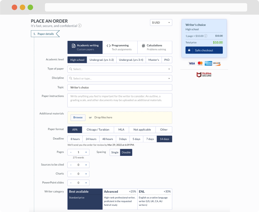
First, you will need to complete an order form. It's not difficult but, if anything is unclear, you may always chat with us so that we can guide you through it. On the order form, you will need to include some basic information concerning your order: subject, topic, number of pages, etc. We also encourage our clients to upload any relevant information or sources that will help.
Complete the order form
Once we have all the information and instructions that we need, we select the most suitable writer for your assignment. While everything seems to be clear, the writer, who has complete knowledge of the subject, may need clarification from you. It is at that point that you would receive a call or email from us.
Writer’s assignment
As soon as the writer has finished, it will be delivered both to the website and to your email address so that you will not miss it. If your deadline is close at hand, we will place a call to you to make sure that you receive the paper on time.
Completing the order and download