© SAP AG Page 1
Product
SAP Analytics Cloud
Level
Undergraduate
Graduate
Beginner
Focus
Data Analysis
Authors
Nitin Kalé
Modified May 2019
Dr. Ed Lindoo
Version
1.0
Motivation
Many courses at SAP University
Alliances member schools use ERP
Simulation Game to introduce students
to the role of integrated business
processes using a business simulation
game. This game simulates a
commodity market wherein teams
have to plan, procure, produce and sell
products in a competitive
environment.
The goal is to strategize and run their
company for profit maximization. The
game is played in the SAP ERP
system while an external simulator
simulates the dynamic market and all
the variables that influence the game.
This exercise can be used during or at
the end of the game to analyze game
data.
PREREQUISITES
Before you use this case study, you need
to have an SAP Analytics Cloud account.
Please follow the instructions later in this
case study to request an SAP Analytics
Cloud account.
The human visual system has evolved to be particularly good at recognizing patterns. Data
visualization has become a standard analytical tool which capitalizes on the ability of humans to
recognize patterns within massive quantities of multi-dimensional data generated by business
information systems. Many scientific studies have led to the creation of visualization models that
utilize human perception and cognition.
When the number of dimensions is small, we can use standard graphing techniques for
visualization e.g. bar charts, line charts, histograms, pie charts and scatter plots.
When the number of dimensions is large, there are several novel techniques for visualizing such
data. They are categorized into the following major areas 1 – For more information on these
visualization techniques, please refer to the journal reference in the footnote.
A. Pixel-oriented Techniques
a. Space filling curves
b. Recursive pattern
c. Snake-Spiral
d. Circle segments
B. Geometric Projection Techniques
a. Parallel coordinates
b. Scatter plot matrix
c. Hyperbox
d. Trellis display
e. Self-organizing maps
C. Icon-based Techniques
a. Star glyphs
b. Color icons
c. Stick figures
d. Chernoff faces
D. Hierarchical and Graph-based Techniques
a. Dimensional stacking
b. Cone trees
c. Mosaic plots
d. Fractal foam
1. The ERPSim game is played by teams over several rounds (up to 8 rounds of 30 virtual days
each). They sell up to six products at a time from a possible 12 products that the market
1 Keim D. A., Kriegel H.-P. Visualization Techniques for Mining Large Databases: A
Comparison , Transactions on Knowledge and Data Engineering, Vol. 8, No. 6, Dec. 1996, pp.
923-938.
© SAP AG Page 2
Data Visualization
Data Visualization for ERPsim
consumes. The products are all muesli cereal2 in various flavors and box sizes. The teams must
forecast demand, run MRP, procure, produce, price and market their products for sale.
2. Figure 1 shows the entire cash to cash cycle in the game. The transactions in bold are decision
points that teams must make and execute. They are considered strategic in nature. The
transactions that are gray are considered operational in nature. They are automated by the
simulator. Additionally, teams can run analytical reports at various points in the game to
monitor and strategize.
Figure 1
3. Data from an actual game have been extracted from SAP ERP and stored in an Access
database. Then queries have been written to report important findings. The results have been
exported to Excel.
4. Your job is to analyze these results as requested in the following assignment
2 http://en.wikipedia.org/wiki/Muesli
© SAP AG Page 3
We will now use SAP Business Analytics.
1. Launch Google Chrome. If you don’t have it, install it as it’s the only browser that work
well.
2. Click the link below to go to SAP Cloud Analytics
https://higher-education.us10.sapanalytics.cloud
(Note: if your browser does not default to Chrome, you will need to copy the URL and
paste it into Chrome)
3. You now see a screen that looks like this:
The first time you come here you’ll need to click the Register button to get the following screen:
Be sure to register with your Nova email address. Any email other than Nova are wiped from the
system on a weekly basis!
4. After you register, you’ll get a screen that looks like this:
© SAP AG Page 4
Using SAP Business Analytics
https://higher-education.us10.sapanalytics.cloud/
Note that it sends an email to your Nova email account for verification.
5. Here’s the email that you should get. Just click on the button to activate your account.
You’ll be taken to a screen that looks like this:
Click the Continue button to get the following screen.
You’re taken to this profile page where you can tweak things if you want to (optional).
Now, log out from the profile page and go back to the sign in page:
© SAP AG Page 5
https://higher-education.us10.sapanalytics.cloud
Sign in with your Nova email and password that you created.
BE SURE TO WRITE YOUR PASSWORD DOWN!
6. Once the system loads, in the top left corner of the screen click on the 3 little bars (Next to
Home):
a. Click Create, then Story
b. Next, click on Add a Canvas Page
Next click on Chart
© SAP AG Page 6
https://higher-education.us10.sapanalytics.cloud/
c. Models have already been created for us and are found in the Public folder.
Click on the Public folder and you’ll see a screen that looks like this:
Now click on Models
© SAP AG Page 7
Select ERPsim Dataset
d. You are now ready to begin charting!
7. Choosing measures and dimensions
a. What is a measure? A measure is a field on which calculations can be made. These
are fields of business interest for analytics. e.g. revenue, profit, quantity sold. The
calculations can sum, min, max, average, count etc. Measures are also called key
figures or facts.
b. What is a dimension? A dimension is reference information about a measure. It
provides context for the measures. E.g. customer, time, product. Revenue by
customer is an example of how you would report a measure by a dimension.
Figure 2
© SAP AG Page 8
1. Interface
a. Look towards the top right of the screen. See the boxes labeled Comparison, Trend,
Distribution, etc.? These allow you to change to various types of charts. Select the bar
chart.
b. Add Revenue to the Measures and Product to the Dimensions
c. You will now see a screen that looks like this:
d. Play around with some of the controls like sorting. Hover over the Product line within
dimensions. You’ll see a filter icon pop up. Change the filter to look only for 1kg items.
e. Add team to color and see what happens.
f. Explore, have fun and get used to the system before moving on.
2. We are now ready to manipulate and visualize this data
a. Several charting options are available for visualization on the right side of the
screen – bars, lines, pies, geographic, scatter/bubble, maps, radar, tag cloud etc.
b. Using the appropriate charting technique, answer the following questions. Hints are
provided for each question.
NOTE: Log off and back on before you begin the exercises below to ensure that all the filters and
settings you applied above in testing are gone!
© SAP AG Page 9
Note, each question is worth 10 pts.
© SAP AG Page 10
Exercises
Analytics Cloud 1 – Revenue by Team
Question: Which team had the highest revenue? What was the revenue?
Time 10 min
Hint: Use a column chart. From Measures, drag Revenue into Y-Axis, from Dimensions, drag
Team into Y-Axis. Find the sort tool next to the database name and change Sort of revenue to
descending. Use Save to save the visualization as Q1. You do not need to submit a screen shot,
just place your answers below.
Analytics Cloud 2 – Revenue by Product
Question: What product had the highest revenue? What was the revenue? Time 10 min
Zeist 10 Min.
Hint: Use a column chart. Y-Axis – Revenue, X-axis – Product. Save As Q2. You do not need to
submit a screen shot, just place your answers below.
© SAP AG Page 11
Analytics Cloud 3 – Revenue by Team and Round
Question: Display the trend of revenue over rounds for each team. Time 10 min
Hint: Use a line chart. Y-Axis – Revenue, X-Axis – Round, Legend Color – Team. For this
answer you do need to submit a screen shot. Alt-PrntScrn on some computers will copy the screen
to the clipboard, you can then paste it into this document. If that doesn’t work you can save this as
Q3. Then use the back arrow to get the main screen where you see Q3 has been saved. Click on
that and when it comes up you can right click on it and save the picture to your computer. Once
it’s saved to your computer you can launch it and typically copy/paste into this document. just
place your answers below. If that doesn’t work, try a screen capture program.
Analytics Cloud 4 – Revenue by Team and Product
Question: What is the market share of each team by product? Time 10 min
Hint: Use a Column chart. X-Axis – Revenue, Y-Axis – Product, Trellis Rows: Team, Save as
Q4. For this answer you need to submit a screen shot. A screen shot of just the first team is all
that is needed here.
© SAP AG Page 12
Analytics Cloud 5 – Revenue by Distribution Channel and Product
Question: Are there any products that don’t sell in specific distribution channels? Time 10 min
Hint: Use a heat map. Area Color – Revenue, Area Name – Distribution Channel & Area Name2
– Product. Save as Q5. For this answer you need to submit a screen shot.
Analytics Cloud 6 – Price by Product and Team
Question: What was the highest price paid for 1kg Raisin Muesli? Which team sold the most
expensive Muesli? What did team MM sell the Muesli for? Time 10 min
Hint: Use a column chart. Y-Axis –Price, X-Axis – Team. Legend Color – Product. In the
resulting chart, add a rank of top 1 for product. Save as Q6. A screen shot is not needed here, just
your 3 answers.
© SAP AG Page 13
Analytics Cloud 7 – Quantity by Team and Product
Question: Which team sold the most quantity of muesli? For that team, what was the most sold
product and for how much? Time 10 min
Hint: Use a tree map (under Heat Map). Area Weight – Quantity, Area Name – Team. Click on
the team with the highest number and select filter. Next, add Product to Area Name. What was
the largest quantity that this team sold? What was the name of this product? No screen shot
necessary, just your two answers. Save as Q7.
Analytics Cloud 8 – Revenue and Price by Product
Question: What three products have high price and high revenue? Time 10 min
Hint: Use a Bubble chart. Measures: Y-axis: Quantity. X-axis: Price. Color: Product, Bubble
Width: Revenue. Be sure there are no filters applied. Save as Q8. No screen shot necessary, just
your three answers.
© SAP AG Page 14
Analytics Cloud 9 – Highest revenue on a day
Question: Show the days on which individual teams did not have any revenue. What team made
the highest revenue on a single day (which round)? Time 10 min
Hint: Use a Heat Map. Measures: Color: Revenue. Dimensions: X Axis: Round and Team.
Dimensions: Y Axis: Day. Save as Q9. Here we need a screen shot of your results which should
look like a lot of light green and dark green squares. Don’t forget to write your answer to the
second part of the question.
Analytics Cloud 10 – Highest revenue for a product on a single day
Question: What product on what day and round brought the highest revenue (for which team)?
Time 10 min
No Hint! Save as Q10. Screen shot not needed, just your answers.
Essay Writing Service Features
Our Experience
No matter how complex your assignment is, we can find the right professional for your specific task. Achiever Papers is an essay writing company that hires only the smartest minds to help you with your projects. Our expertise allows us to provide students with high-quality academic writing, editing & proofreading services.
Free Features
Free revision policy
$10Free bibliography & reference
$8Free title page
$8Free formatting
$8How Our Dissertation Writing Service Works

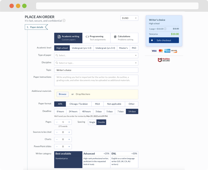
First, you will need to complete an order form. It's not difficult but, if anything is unclear, you may always chat with us so that we can guide you through it. On the order form, you will need to include some basic information concerning your order: subject, topic, number of pages, etc. We also encourage our clients to upload any relevant information or sources that will help.
Complete the order form
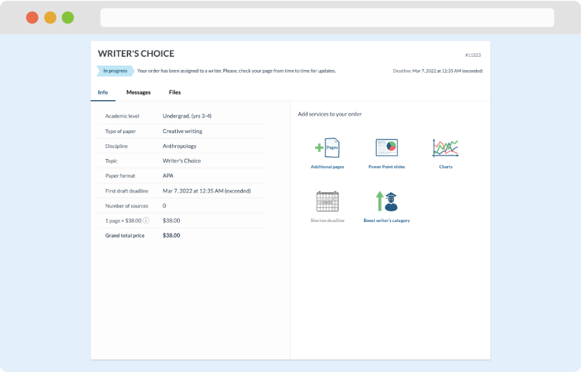
Once we have all the information and instructions that we need, we select the most suitable writer for your assignment. While everything seems to be clear, the writer, who has complete knowledge of the subject, may need clarification from you. It is at that point that you would receive a call or email from us.
Writer’s assignment
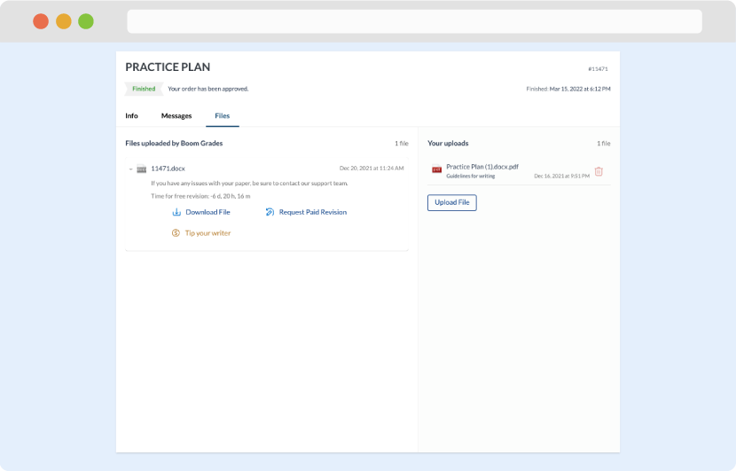
As soon as the writer has finished, it will be delivered both to the website and to your email address so that you will not miss it. If your deadline is close at hand, we will place a call to you to make sure that you receive the paper on time.
Completing the order and download