Step 0: Understand the data
Step 1: Define tables and change table names
Step 2: Set relationships among tables : is to link the tables using identifiers.
Primary Key: an attribute (column) that uniquely identifies each row (observation) in a table
Foreign Key: the other table’s primary key that is in current table and will be used to link the other table.
Step 3: Set and modify attributes for Visualizations using pivot table and pivot chart
Step 4: Output bar chart for Total sales amount by store locations
Step 5: Output bar chart for sales amount of Hypericum by store locations
Excel HW#4 – Ch 11
Purpose: Use excel in data visualization (book p.300-309) Mac users need to use Virtual PC to complete
this assignment.
Data: Ch11 Data file on canvas
Required:
Perform and present an analysis of total sales amount by store locations using excel.
Step 0: Understand the data
Step 1: Define tables and change table names
Step 2: Set relationships among tables : is to link the tables using identifiers.
Primary Key: an attribute (column) that uniquely identifies each row (observation) in a table
Foreign Key: the other table’s primary key that is in current table and will be used to link the
other table.
Step 3: Set and modify attributes for Visualizations using pivot table and pivot chart
Step 4: Output bar chart for Total sales amount by store locations
Step 5: Output bar chart for sales amount of Hypericum by store locations
To be submitted:
Please submit your assignment in WORD file. Put your screen shot in a WORD file, clearly label your
screenshot such as “Step1”. Put the homework title, your section, and your name in the Title of the file
and name the file the same way “HWTitle_01-JamesBond”. Use your name and section number as the
header in the Word file, such as “01_JamesBond”. Insert page numbers. Points will be deducted if not
following the instructions and you will receive a 0 if not submitted in a WORD file.
1. Screenshot after you finish each step.
– Include your name inside your screenshot
– for bar charts, include your names in the title.
– when you screenshot a large dataset, just screen shot the first 10 or more rows.
Chapter 11
Data Analytics in Accounting
Tools and Practice
VALERIE LI
SAN DIEGO STATE UNIVERSITY
Data Visualization
The process of presenting information graphically.
One way of sharing the story and turning data into
information.
Presenting relevant information to decision makers.
Information Value Chain from Chapter 1
© McGraw Hill
11a-2
Data Visualization Process
1
1. Understand the data.
2. Select the data visualization tool.
• Excel.
• Tableau.
• Power BI (not covered)
• Others.
3. Develop and present the visualization.
• Create or reinforce knowledge.
• Choose the right chart.
© McGraw Hill
11a-3
Data Visualization Process
© McGraw Hill
2
Potential
Problems/Suggested
Limits
Type of Data
Type of Chart
Purpose
Examples
Categorical
Vertical bar,
horizontal bar,
treemaps, bubble
charts
Comparisons of
performance
metrics
Revenue or profit comparisons
among divisions or stores
Too many categories;
limit number of bars
(fewer for vertical than
horizontal)
Univariate
Histograms
Frequencies, range
of values, most
likely values
Stock returns, stock betas for an
industry
Bins too large to show
detail
Multivariate
relationships
Scatter plots
Relationships,
correlations
Comparing return on equity and
stock returns
Too many trees to see
forest (too much detail
and lack of clear
relationship)
Geospatial
Maps, symbol maps
Comparisons among
locations
Relative sales by state
Too few symbols too
spread out; too many
symbols on the map
Time trends
Line charts
Comparison over
time
Sales by year and quarter
Too many lines; limit to
five or less
Proportional
Pie charts, doughnut
charts, treemaps
Comparison of parts
to a whole
Division net profit slices in total;
company net profit pie
All slices similar size; too
many slices; limit to five
slices or less
11a-4
Categorical Charts
Vertical or horizontal bar charts present categorical information.
© McGraw Hill
11a-5
Univariate Data
Histograms show the distribution of a single variable across a range of values, grouped
into bins that show the frequency or percentage of values in that bin.
© McGraw Hill
11a-6
Multivariate Relationships
Scatter plots show correlations between two continuous variables, such as height and
weight, or GPA and SAT scores. Scatter plots present detailed data for the two
variables; each dot represents a single data point.
© McGraw Hill
11a-7
Time Trends
Line charts are used to show values over time for one or more categories.
© McGraw Hill
11a-8
Proportional
Proportion charts, such as pie or doughnut charts, show shares of a total at a single
point in time. These charts should be limited to a few slices with clear differences in size.
© McGraw Hill
11a-9
Takeaways
•Data visualization is the process of presenting information graphically to share the story and
turning data into information, the last step of the AMPS model in Chapter 10.
•We will show two common visualization tools: Excel and Tableau
•We can use different ways to graph different type of data.
Essay Writing Service Features
Our Experience
No matter how complex your assignment is, we can find the right professional for your specific task. Achiever Papers is an essay writing company that hires only the smartest minds to help you with your projects. Our expertise allows us to provide students with high-quality academic writing, editing & proofreading services.
Free Features
Free revision policy
$10Free bibliography & reference
$8Free title page
$8Free formatting
$8How Our Dissertation Writing Service Works
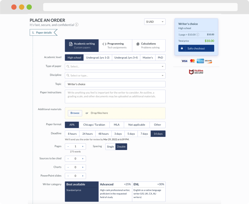
First, you will need to complete an order form. It's not difficult but, if anything is unclear, you may always chat with us so that we can guide you through it. On the order form, you will need to include some basic information concerning your order: subject, topic, number of pages, etc. We also encourage our clients to upload any relevant information or sources that will help.
Complete the order form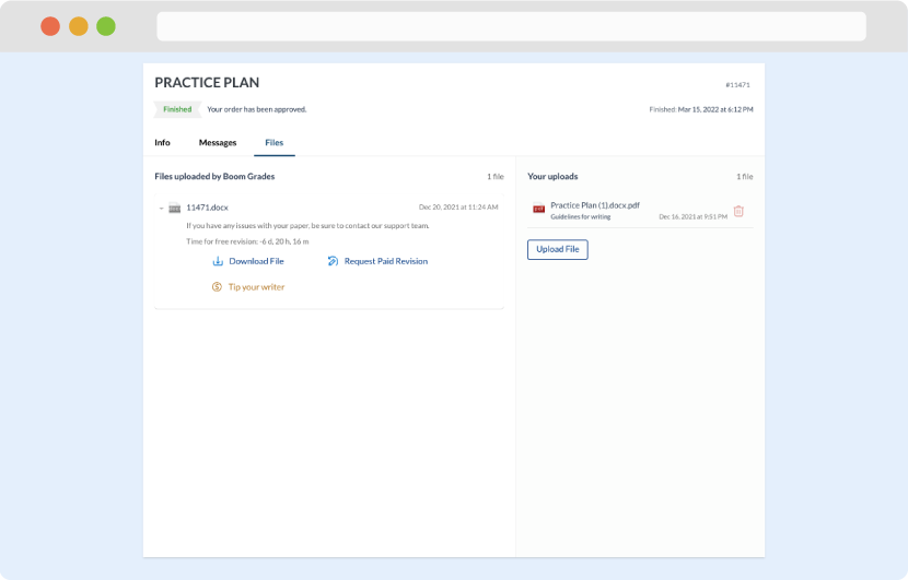
Once we have all the information and instructions that we need, we select the most suitable writer for your assignment. While everything seems to be clear, the writer, who has complete knowledge of the subject, may need clarification from you. It is at that point that you would receive a call or email from us.
Writer’s assignment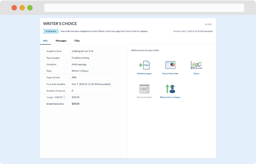
As soon as the writer has finished, it will be delivered both to the website and to your email address so that you will not miss it. If your deadline is close at hand, we will place a call to you to make sure that you receive the paper on time.
Completing the order and download