Create bar chart, pie chart, and Pareto diagram for “How do you spend the holidays” data.
Chapter 2
Organizing and
Visualizing Variables
Learning Objectives
In this chapter, you will learn:
▪ To develop tables and charts for categorical
data
▪ To develop tables and charts for numerical
data
▪ The principles of properly presenting graphs
Chap 2-2
Organizing Categorical Data:
Summary Table
▪
A summary table indicates the frequency, amount, or
percentage of items in a set of categories so that you can see
differences between categories.
How do you spend the holidays?
Percent
At home with family
45%
Travel to visit family
38%
Vacation
5%
Catching up on work
5%
Other
7%
Chap 2-3
Visualizing Categorical Data:
Bar Chart
▪
In a bar chart, a bar shows each category, the length of
which represents the amount, frequency or percentage of
values falling into a category.
How Do You Spend the Holidays?
Other
7%
Catching up on w ork
5%
Vacation
5%
Travel to visit family
38%
At home w ith family
45%
0%
5%
10%
15%
20%
25%
30%
35%
40%
45%
50%
Chap 2-4
Visualizing Categorical Data:
Pie Chart
▪
The pie chart is a circle broken up into slices that represent
categories. The size of each slice of the pie varies according
to the percentage in each category.
How Do You Spend the Holiday’s
5%
7%
5%
At home with family
45%
Travel to visit family
Vacation
Catching up on work
Other
38%
Chap 2-5
Visualizing Categorical Data:
Pareto Diagram
▪ Used to portray categorical data
▪ A bar chart, where categories are shown in
descending order of frequency
▪ A cumulative polygon is shown in the same graph
▪ Used to separate the “vital few” from the “trivial
many”
Chap 2-6
Visualizing Categorical Data:
Pareto Diagram
How Do You Spend the Holidays?
50%
100%
100%
95%
83%
40%
Percentage
90%
90%
80%
35%
70%
30%
60%
25%
50%
45%
20%
40%
38%
15%
30%
10%
20%
5%
7%
Cumulative Percentage
45%
10%
5%
5%
Vacation
Catching up on work
0%
0%
At home with family
Travel to visit family
Other
Chap 2-7
Organizing Numerical Data:
Ordered Array
▪
An ordered array is a sequence of data, in rank order, from
the smallest value to the largest value.
Age of
Surveyed
College
Students
Day Students
16
17
17
18
18
18
19
19
20
20
21
22
22
25
27
32
38
42
Night Students
18
18
19
19
20
21
23
28
32
33
41
45
Chap 2-8
Organizing Numerical Data:
Stem and Leaf Display
▪ A simple way to see how the data are distributed
and where concentrations of data exist.
METHOD: Separate the sorted data series
into leading digits (the stems) and
the trailing digits (the leaves).
Organizing Numerical Data:
Stem and Leaf Display
▪
A stem-and-leaf display organizes data into groups (called
stems) so that the values within each group (the leaves)
branch out to the right on each row.
Age of College Students
Day Students
Night Students
Stem Leaf
Stem Leaf
1
67788899
1
8899
2
0012257
2
0138
3
28
3
23
4
2
4
15
Chap 2-10
Organizing Numerical Data:
Frequency Distribution
▪
The frequency distribution is a summary table in which the
data are arranged into numerically ordered class groupings.
▪
You must give attention to selecting the appropriate number of
class groupings for the table, determining a suitable width of a
class grouping, and establishing the boundaries of each class
grouping to avoid overlapping.
▪
To determine the width of a class interval, you divide the
range (Highest value–Lowest value) of the data by the number
of class groupings desired.
Chap 2-11
Organizing Numerical Data:
Frequency Distribution Example
Example: A manufacturer of insulation randomly selects 20
winter days and records the daily high temperature
24, 35, 17, 21, 24, 37, 26, 46, 58, 30, 32, 13, 12, 38, 41, 43, 44, 27, 53, 27
Chap 2-12
Organizing Numerical Data:
Frequency Distribution Example
▪ Sort raw data in ascending order:
12, 13, 17, 21, 24, 24, 26, 27, 27, 30, 32, 35, 37, 38, 41, 43, 44, 46, 53, 58
▪ Find range: 58 – 12 = 46
▪ Select number of classes: 5 (usually between 5 and 15)
▪ Compute class interval (width): 10 (46/5 then round up)
▪ Determine class boundaries (limits): 10, 20, 30, 40, 50, 60
▪ Compute class midpoints: 15, 25, 35, 45, 55
▪ Count observations & assign to classes
Chap 2-13
Organizing Numerical Data:
Frequency Distribution Example
Class
10 but less than 20
20 but less than 30
30 but less than 40
40 but less than 50
50 but less than 60
Total
Frequency
Relative
Frequency
Percentage
3
6
5
4
2
20
.15
.30
.25
.20
.10
1.00
15
30
25
20
10
100
Chap 2-14
Organizing Numerical Data:
Cumulative percentage distribution
Chap 2-15
Why Use a Frequency Distribution?
▪ It condenses the raw data into a more
useful form.
▪ It allows for a quick visual interpretation of
the data.
▪ It enables the determination of the major
characteristics of the data set including
where the data are concentrated /
clustered.
Frequency Distributions: Some Tips
▪
Different class boundaries may provide different pictures
for the same data (especially for smaller data sets).
▪
Shifts in data concentration may show up when different
class boundaries are chosen.
▪
As the size of the data set increases, the impact of
alterations in the selection of class boundaries is greatly
reduced.
▪
When comparing two or more groups with different
sample sizes, you must use either a relative frequency or
a percentage distribution.
Visualizing Numerical Data:
The Histogram
▪
A graph of the data in a frequency distribution is called a
histogram.
▪
The class boundaries (or class midpoints) are shown on the
horizontal axis.
▪
The vertical axis is either frequency, relative frequency, or
percentage.
▪
The horizontal axis display the variable of interest.
▪
Bars of the appropriate heights are used to represent the
number of observations within each class.
Chap 2-18
Visualizing Numerical Data:
The Histogram
10 but less than 20
20 but less than 30
30 but less than 40
40 but less than 50
50 but less than 60
Total
Frequency
3
6
5
4
2
20
Relative
Frequency
Percentage
.15
.30
.25
.20
.10
1.00
15
30
25
20
10
100
Histogram: Daily High
Temperature
7
6
6
Frequency
Class
5
5
4
4
3
3
2
2
1
0
0
0
5
15
25
35
45
55
More
Chap 2-19
Visualizing Numerical Data:
The Polygon
▪ A percentage polygon is formed by having the
midpoint of each class represent the data in that class
and then connecting the sequence of midpoints at
their respective class percentages.
▪ The cumulative percentage polygon, or ogive,
displays the variable of interest along the X axis, and
the cumulative percentages along the Y axis.
Chap 2-20
Visualizing Numerical Data:
The Polygon
Class
10 but less than 20
20 but less than 30
30 but less than 40
40 but less than 50
50 but less than 60
Total
Frequency
Relative
Frequency
Percentage
.15
.30
.25
.20
.10
1.00
15
30
25
20
10
100
3
6
5
4
2
20
Frequency Polygon: Daily High Tem perature
7
(In a percentage polygon
the vertical axis would
be defined to show the
percentage of
observations per class)
Frequency
6
5
4
3
2
1
0
5
15
25
35
45
55
More
Chap 2-21
Visualizing Numerical Data:
The Frequency Polygon
Useful When Comparing Two or More Groups
Visualizing Numerical Data:
The Percentage Polygon
Visualizing Numerical Data:
The Cumulative Percentage Polygon
Lower
Boundary
% Less Than
Lower Boundary
10
Essay Writing Service Features
Our Experience
No matter how complex your assignment is, we can find the right professional for your specific task. Achiever Papers is an essay writing company that hires only the smartest minds to help you with your projects. Our expertise allows us to provide students with high-quality academic writing, editing & proofreading services.
Free Features
Free revision policy
$10Free bibliography & reference
$8Free title page
$8Free formatting
$8How Our Dissertation Writing Service Works
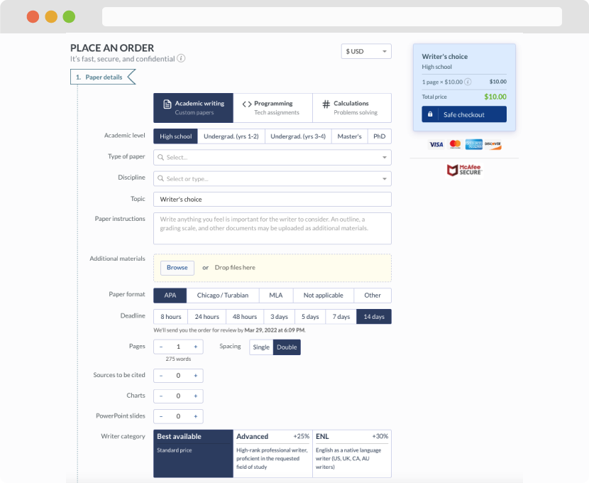
First, you will need to complete an order form. It's not difficult but, if anything is unclear, you may always chat with us so that we can guide you through it. On the order form, you will need to include some basic information concerning your order: subject, topic, number of pages, etc. We also encourage our clients to upload any relevant information or sources that will help.
Complete the order form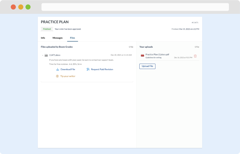
Once we have all the information and instructions that we need, we select the most suitable writer for your assignment. While everything seems to be clear, the writer, who has complete knowledge of the subject, may need clarification from you. It is at that point that you would receive a call or email from us.
Writer’s assignment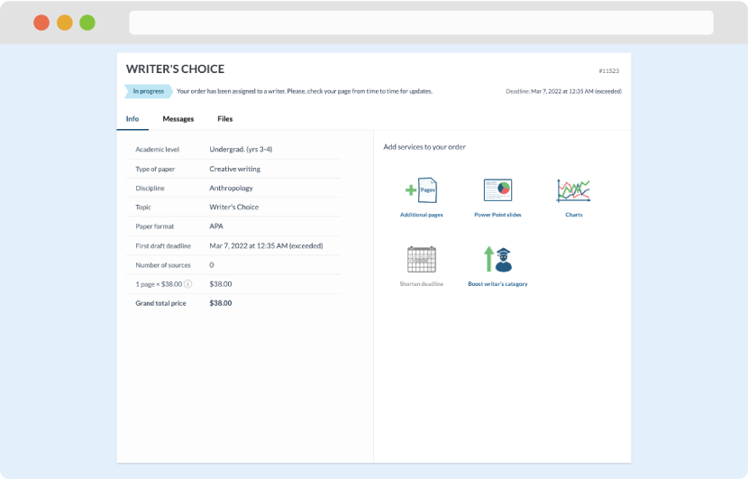
As soon as the writer has finished, it will be delivered both to the website and to your email address so that you will not miss it. If your deadline is close at hand, we will place a call to you to make sure that you receive the paper on time.
Completing the order and download