In this lab, we’ll get a short introduction to doing some basic data visualization and exploration using the Jamovi software. For this assignment, you’ll need access to the software and the data set we’ll be working with.
Software: You can download jamovi onto a Mac or PC by following the link here: https://www.jamovi.org/user-manual.html#installation\Links to an external site.. You can also access a web-browser version with no installation needed here: https://cloud.jamovi.org\\Links to an external site..NOTE: the web-browser version is still new and always changing a bit, and so it can sometimes be unstable. The main issue is that it will “time-out” after not being used for a while, and so saving often is encouraged.Data Set: Download the WineRatingsSampled.csvEdit\Download WineRatingsSampled.csv data set. For now, just save this somewhere on your computer where you can find it easily. You will open this in Jamovi directly, and you shouldn’t need to do anything to the data set to get it ready.
One last thing that will likely be helpful is taking some screenshots of the graphs and tables we produce. Visit
https://www.take-a-screenshot.org/\Links to an external site.
to learn how to take a screenshot using the device you’re on.
You should go through the tasks below and write up a short report. This should read like and essay, and you can use any editor you’d like (Google Docs, Word, Pages, etc). You’ll eventually submit your submission as either a Word doc file or a pdf. Feel free to use the titles for the tasks to organize your report.
Data Exploration
First, just take a couple of minutes to explore the data. If you click on the Variables tab on the top, you will see a list of all of the variables in this data set. We’ll only be interested in a couple of them. You can see a spreadsheet of the data in the Data tab. This is sometimes helpful to just see what kinds of variables we have: which ones are numbers and which ones are categories or other text descriptions. For a description of the different variables in this data set, scroll to the bottom of this assignment to view the Data Documentation.
Once you’ve got a handle on what this kind of looks like, click on the Analyses tab. This will be the main place that we do work in Jamovi. We are going to get some basic data visualizations to interpret and explain in this lab. Everything that we will need is in the Exploration menu, under Descriptives. So go there, and we’ll begin the lab!
You should include a short introduction to this data set: explain what it is, and what we are exploring.
We’re first going to explore the different categories of wine in this data set.
Add the “category” variable to the Variableswindow. You can do this by clicking and dragging it, or selecting it and then clicking the arrow button to add to the Variables window. There will be a little checkbox underneath that says “Frequency tables.” Click that to get Jamovi to display the frequency distribution of the categories of wine. It will display on the right, in the Results window.
Now, under “Plots” below, select a bar plot.
Include In Your Report
Include a screenshot of the frequency table and the bar plot. Explain what these tell us about the distribution of wine categories. Compare the two, explaining which one you think does a better job of showing the distribution of categories. Include your reasons.
Now, we’re going to look at the alcohol content, price, and rating of each wine in this data set. You can either start a new “Descriptives” section in your Results window by clicking Descriptives from the Exploration menu again, or you can remove the “category” variable and start over.
Add the variables “alcohol,” “price,” and “rating” to the Variables window. You can do this by clicking and dragging each one over, or selecting each one and then clicking the arrow button to add to the Variables window.
This will immediately display a table in the Results window on the right. We’re going to customize that table a bit. You should see a drop-down menu labeled “Descriptives.” You can change the option between “Variables across rows” and Variables across columns. This will change how the table is laid out. Choose whichever you like best.
Under the “Statistics” menu, you can select which descriptive statistics you would like to include in the table. There are a lot of options! Let’s just include the mean, median, and standard deviation.
Under the “Plots” menu, we have more options of which kind of plots to include. For now, select histogram and box plot. You should have the six graphs (three histograms and three boxplots) now in the Results window on the right.
Include In Your Report
Include the table you created, and explain what it is reporting. You should give a brief interpretation of each value, and what it says about the data.
Next, you should summarize the histograms. Include the pictures in your report, and describe them in terms of their shape, their center, and their spread. You should compare them to each other, but note that they are on different scales.
Then, add the boxplots. Again, interpret each one and describe what information they tell us about the variables, and compare them to each other.
Finally for this section, compare the boxplots and histograms overall. Which one do you think more effectively summarizes the data? Which one gives a better comparison of the two variables? Explain your answers.
For this next task, you’ll choose either “alcohol,” “price” or “rating” variable to work with. Put your choice in the “Variables” window, and then add the “category” variable to the “Split by” window. This will add a second variable, the type or category of wine, to the analysis.
Again, include a table with the mean, median, and standard deviation, but add IQR as well. I normally like to orient the table by choosing “Variables across rows.”
Again, choose to display histograms and boxplots.
Include In Your Report
Include the table you created, and describe the differences in these values across the different categories. What are the things to notice, and what do they mean about the variable you selected across different categories?
Now include the histograms and boxplots. For each, interpret. Describe what these visuals tells you about the differences between categories for your variable.
Between the histograms and the boxplots, which ones do you think do a better job of illustrating these differences? Why? Explain your reasoning.
Introduction
In this lab, we’ll get a short introduction to doing some basic data visualization and exploration using the Jamovi
software. For this assignment, you’ll need access to the software and the data set we’ll be working with.
• Software: You can download jamovi onto a Mac or PC by following the link here: https://www.jamovi.org/user-
manual.html#installation . You can also access a web-browser version with no installation needed here:
https://cloud.jamovi.org B.
。 NOTE: the web-browser version is still new and always changing a bit, and so it can sometimes be unstable. The
main issue is that it will “time-out” after not being used for a while, and so saving often is encouraged.
• Data Set: Download the WineRatingsSampled.csv ✓ data set. For now, just save this somewhere on your
computer where you can find it easily. You will open this in Jamovi directly, and you shouldn’t need to do anything
to the data set to get it ready.
One last thing that will likely be helpful is taking some screenshots of the graphs and tables we produce. Visit
https://www.take-a-screenshot.org/to learn how to take a screenshot using the device you’re on.
You should go through the tasks below and write up a short report. This should read like and essay, and you can use
any editor you’d like (Google Docs, Word, Pages, etc). You’ll eventually submit your submission as either a Word doc
file or a pdf. Feel free to use the titles for the tasks to organize your report.
Tasks
First, just take a couple of minutes to explore the data. If you click on the Variables tab on the top, you will see a list of
all of the variables in this data set. We’ll only be interested in a couple of them. You can see a spreadsheet of the data
in the Data tab. This is sometimes helpful to just see what kinds of variables we have: which ones are numbers and
which ones are categories or other text descriptions. For a description of the different variables in this data set, scroll
to the bottom of this assignment to view the Data Documentation.
Once you’ve got a handle on what this kind of looks like, click on the Analyses tab. This will be the main place that we
do work in Jamovi. We are going to get some basic data visualizations to interpret and explain in this lab. Everything
that we will need is in the Exploration menu, under Descriptives. So go there, and we’ll begin the lab!Include In Your Report
You should include a short introduction to this data set: explain what it is, and what we are exploring.
Category
We’re first going to explore the different categories of wine in this data set.
Add the “category” variable to the Variables window. You can do this by clicking and dragging it, or selecting it and
then clicking the arrow button to add to the Variables window. There will be a little checkbox underneath that says
“Frequency tables.” Click that to get Jamovi to display the frequency distribution of the categories of wine. It will
display on the right, in the Results window.
Now, under “Plots” below, select a bar plot.
Include In Your Report
Include a screenshot of the frequency table and the bar plot. Explain what these tell us about the distribution of wine
categories. Compare the two, explaining which one you think does a better job of showing the distribution of
categories. Include your reasons.
Alcohol, Price, and Rating
Now, we’re going to look at the alcohol content, price, and rating of each wine in this data set. You can either start a
new “Descriptives” section in your Results window by clicking Descriptives from the Exploration menu again, or you can
remove the “category” variable and start over.
Add the variables “alcohol,” “price,” and “rating” to the Variables window. You can do this by clicking and dragging each
one over, or selecting each one and then clicking the arrow button to add to the Variables window.
This will immediately display a table in the Results window on the right. We’re going to customize that table a bit. You
should see a drop-down menu labeled “Descriptives.” You can change the option between “Variables across rows” and
Variables across columns. This will change how the table is laid out. Choose whichever you like best.
Under the “Statistics” menu, you can select which descriptive statistics you would like to include in the table. There are
a lot of options! Let’s just include the mean, median, and standard deviation.Under the “Plots” menu, we have more options of which kind of plots to include. For now, select histogram and box
plot. You should have the six graphs (three histograms and three boxplots) now in the Results window on the right.
Include In Your Report
Include the table you created, and explain what it is reporting. You should give a brief interpretation of each value, and
what it says about the data.
Next, you should summarize the histograms. Include the pictures in your report, and describe them in terms of their
shape, their center, and their spread. You should compare them to each other, but note that they are on different
scales.
Then, add the boxplots. Again, interpret each one and describe what information they tell us about the variables, and
compare them to each other.
Finally for this section, compare the boxplots and histograms overall. Which one do you think more effectively
summarizes the data? Which one gives a better comparison of the two variables? Explain your answers.
Grouping by Category
For this next task, you’ll choose either “alcohol,” “price” or “rating” variable to work with. Put your choice in the
“Variables” window, and then add the “category” variable to the “Split by” window. This will add a second variable, the
type or category of wine, to the analysis.
Again, include a table with the mean, median, and standard deviation, but add IQR as well. I normally like to orient the
table by choosing “Variables across rows.”
Again, choose to display histograms and boxplots.
Include In Your Report
Include the table you created, and describe the differences in these values across the different categories. What are
the things to notice, and what do they mean about the variable you selected across different categories?
Now include the histograms and boxplots. For each, interpret. Describe what these visuals tells you about the
differences between categories for your variable.Between the histograms and the boxplots, which ones do you think do a better job of illustrating these differences?
Why? Explain your reasoning.
Submission
Write your report as a kind of coherent essay. You should use full sentences and paragraphs, and include your images
throughout the report. Include an introduction, giving some idea of what we will be doing in this assignment, as well as
a conclusion at the end.
Save your file as a .pdf, .doc, or .docx, and upload the file to Canvas.
Data Documentation
Variable
wine
winery
category
designation
varietal
appellation
alcohol
price
rating
reviewer
review
Description
Name of the wine.
Winery that the wine came from.
Type of wine (red, white, sparkling, etc.)
Name of the wine given by the producers.
Variety or subcategory of wine.
Originating region.
Percent alcohol by volume.
Retail price for the bottle in US dollars.
Rating out of 100.
Name of the reviewer.
Full text of the review.
Essay Writing Service Features
Our Experience
No matter how complex your assignment is, we can find the right professional for your specific task. Achiever Papers is an essay writing company that hires only the smartest minds to help you with your projects. Our expertise allows us to provide students with high-quality academic writing, editing & proofreading services.
Free Features
Free revision policy
$10Free bibliography & reference
$8Free title page
$8Free formatting
$8How Our Dissertation Writing Service Works

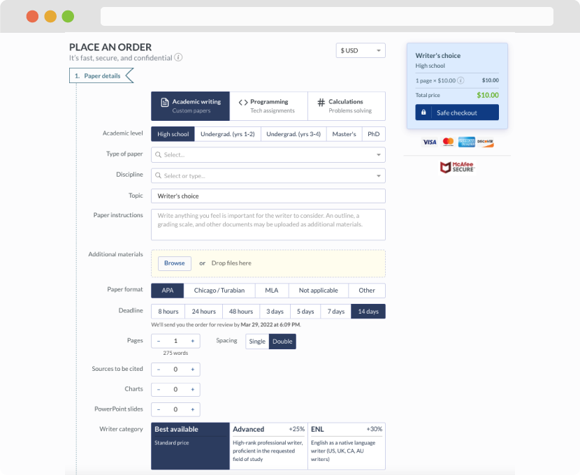
First, you will need to complete an order form. It's not difficult but, if anything is unclear, you may always chat with us so that we can guide you through it. On the order form, you will need to include some basic information concerning your order: subject, topic, number of pages, etc. We also encourage our clients to upload any relevant information or sources that will help.
Complete the order form
Once we have all the information and instructions that we need, we select the most suitable writer for your assignment. While everything seems to be clear, the writer, who has complete knowledge of the subject, may need clarification from you. It is at that point that you would receive a call or email from us.
Writer’s assignment
As soon as the writer has finished, it will be delivered both to the website and to your email address so that you will not miss it. If your deadline is close at hand, we will place a call to you to make sure that you receive the paper on time.
Completing the order and download